Loading...
Loading...
Loading...
Loading...
Loading...
Loading...
Loading...
Loading...
Loading...
Loading...
Loading...
Loading...
Loading...
Loading...
Loading...
Loading...
Loading...
Loading...
Loading...
Loading...
Loading...
Loading...
Loading...
Loading...
Loading...
Loading...
Loading...
Loading...
Loading...
Loading...
Loading...
Loading...
Loading...
Loading...
Loading...
Loading...
Loading...
Loading...
Loading...
Loading...
Loading...
Loading...
Loading...
Loading...
Loading...
Loading...
Loading...
Loading...
Loading...
Loading...
Loading...
Loading...
Loading...
Loading...
Loading...
Loading...
Loading...
Loading...
Loading...
Loading...
Loading...
Welcome to the Juicebox documentation! Here you'll find resources and information on creating and sharing your Juicebox reports, as well as tips and troubleshooting advice. We hope you find this resource helpful.
We are continually updating the documentation to reflect what's new in Juicebox. If you spot an area that is missing or could be improved, please reach out to us to let us know.
Creating reports in Juicebox requires a computer with an internet connection and a browser. Juicebox supports the latest, stable release of the following browsers:
Apple Safari
Google Chrome
Mozilla Firefox
Microsoft Edge
Creating and editing reports requires a browser with a width of at least 960 px.
Capture
Annotate
Share
Collect
Each slice is limited to ingredients from a single data table. But you can use multiple data tables within the same story.
When configuring a chart in an app with multiple data tables, you select the data table to use for the chart.
If you do use multiple data tables within a story, please note that filtering between slices using different data tables will only work for ingredients having the same ingredient id in each data table. To see the ingredient id for a particular ingredient, open the ingredient editor, click the gear icon, select Copy ingredient id, and paste it somewhere. If the ingredient ids do not match across multiple data tables, .
New ingredients are created by duplicating an existing ingredient and then modifying it as needed. To duplicate an ingredient, open the ingredient editor for the ingredient you want to duplicate, click the the gear icon, and select Duplicate column or Duplicate. The ingredient editor for the duplicated ingredient will open, ready for you to modify and save.
The Card slice is used to display selected columns and measures on cards. Users can select cards to filter downstream results. Here's an example of a Card slice:
On the Configure tab, you can add the following:
Title. A dimension ingredient with values to display as card titles.
Long text. A dimension ingredient with values to display as card text.
Secondary data. Up to 3 measure ingredients to display on each card.
Image. A dimension ingredient with urls to images to display on each card.
All configuration fields are optional, but you must make a selection in at least one of the fields. In most cases, you will want to configure at least the Title field. There will be a card for each distinct combination of
The ingredient editor is a form used to view and edit ingredients. To access the ingredient editor, click on the ingredient pill, either in the data drawer or when configuring charts.
Different options appear in the ingredient editor depending on whether the ingredient is a dimension or a measure and whether the ingredient is a number, date, time, or place. Some of the options only affect particular chart types.
Ingredients are used to configure in Juicebox. There are two types of ingredients: and .
When you first load your data, you'll have one dimension ingredient for each column in your data. You can create additional dimensions from those data columns. For example, let's say your data has 3 columns: First_Name, Last_Name, and Age. After you load your data, you'll have 3 dimension ingredients corresponding to these 3 columns.
The Headline slice lets you combine images, text, and actions to create custom headers for your report or sections within you report. Here's an example of a configured Headline slice:
On the Configure tab, you can add the following:
Icon or Logo. You can select an icon or upload a logo image.
Announcement. You can add text that has a special style applied.
Announcement action. Using the Action builder form, you can add a link to a website or to a slice slug within the report. This link will appear next to the Announcement text.
Actions. Using the Action builder form, you can add a link to a website or to a slice slug within the report. Each link will appears as a button. You can have multiple Action buttons.
Feature image
Use the Juicebox API to perform user setup and request an embeddable url to show a user an app. That embeddable url can be used as an iFrame src to display the Juicebox in your website.
The Juicebox API is documented .


Here are some tips and tricks we've learned along the way to help you build great reports:
Telling data storiesVisual designPreparing your dataUseful resourcesMenu
Duplicate
Duplicate as Advanced
Copy ingredient ID
Delete
Field formula
Label
Number format. Select how values should be formatted from the dropdown, or enter a custom number format.
Date format. (For min(date) or max(date))
Description
Color
Color when negative
Image url
Filter
Reverse. By default in the Leaderboard, higher numbers are deemed "better." To flip this for a particular measure, turn on Reverse.
Ranges. To show Measure Chooser or Card gauges or to colorize measure cells in a Table, ranges will need to be defined. Here's an example of ranges defined for a Sales measure:
In this example, there are three ranges: "Below", "On Target", and "Above". Each range is represented by a different color using hex codes and has a specific start and end value. The "Below" range starts at 0 and ends at 4 million, the "On Target" range ends at 5.5 million, and the "Above" range ends at 20 million.
- color: "#ee6055"
label: Below
endValue: 4000000
startValue: 0
- color: "#eaf4f4"
label: On Target
endValue: 5500000
- color: "#60d394"
label: Above
endValue: 20000000Here's the Configure tab for the example above:
On the Style tab, you can adjust how the elements display in the slice. Here's the Style tab for the example above:
There are two gauge card styles: Detail Gauge and Simple Gauge. These require a special configuration.
At least one measure ingredient will need to be added to the Card slice configuration. Each measure ingredient will need to have ranges defined in the Advanced/Ranges section of the measure ingredient editor, like so:
In this example, we have three ranges: "Poor", "Meh", and "Top Tier". Each range is represented by a different color and has a specific start and end value. The "Poor" range starts at 0 and ends at 0.4, the "Meh" range ends at 0.7, and the "Top Tier" range ends at 1.
Here's a Card slice with the Simple Gauge card style:
The Sales measure used in this example has the following ranges defined under Advanced/Ranges in the measure ingredient editor:
In this example, there are three ranges: "Below", "On Target", and "Above". Each range is represented by a different color using hex codes and has a specific start and end value. The "Below" range starts at 0 and ends at 4 million, the "On Target" range ends at 5.5 million, and the "Above" range ends at 20 million.

You can click on the ingredient pill to open the ingredient editor. The ingredient editor is where you can see and modify the ingredient definition.
To create a new dimension, you could duplicate the First Name ingredient and modify it to add a new dimension ingredient called Full Name that concatenates First_Name and Last_Name together. After that, you'll have 4 dimension ingredients.
Measures are values calculated over a group of data records. Average sales, student count, and maximum price are all examples of measures. Measures are created using the following aggregation formulas: sum(), avg(), min(), max(), and count_distinct(). Additional aggregations can be used as well (see advanced field formulas) . Measures are not displayed in the data preview. Instead you see existing measures and add new ones as you configure charts.
As with dimensions, you can click on measure ingredient pills to open the ingredient editor.
Here's the Configure tab for the example above:
On the Style tab, you can adjust how the elements display in the slice. Here's the Style tab for the example above:


From the data preview you can see the data table columns, each column's data type, and the first 100 rows in the data table. You can also open the dimension ingredient editor by clicking on the pill at the top of each column.
To open the data preview, first open the data drawer and then select the data table you want to view. To exit the data preview, close the data drawer.
From the data preview, you can see each column in your data and the data types for each column.
Here are data types that are recognized in Juicebox:
Certain things in Juicebox require particular data types. For example, creating a sum or average measure only works with number columns, and the chart requires a date or time column. Bottom line: Don't mix-and-match data types within the same column in your data file. Number columns should contain only numbers, date columns should contain only dates, and so on. If a column has more than one type of data, it will get the text data type.
To update uploaded data, click the Replace file button. If there is more than one data table in your report, select the data table that you want to update. (Alternatively, select the data table you want to update, click the gear icon, and select Replace file from the menu.) Then, select the new data file (CSV, XLS, or XLSX).
Once the upload process finishes, refresh the page. The report will then display the updated data.
It is good practice to share before replacing data. That way, if you select the wrong CSV (or something else goes wrong), you can Discard changes and revert back to where things were before doing the replace.
To improve performance, charts display cached data. The cache is cleared periodically (by default, every 2 hours), but the cache can be cleared manually by clicking the Clear Data Cache button and selecting Yes, clear it. The cache will be cleared for all data tables used in the report.
The caching period is set at the database connection level and the current options are: no caching, cleared after 2 hours, cleared after 1 day, or cleared after 1 year. If you would like the caching period adjusted for a particular database connection, .
If you have a data table that you don't plan to use in your report, you may want to delete the data table to declutter the data drawer. To do this, open the data drawer, select the data table you want to delete, click the gear icon, and select Delete.
You will receive a warning message if the data table columns are used in your report.
If you are sure you want to delete the data table, click Yes, delete it.
For uploaded data tables, you can download the data by opening the data drawer, selecting the data table you want to download, clicking the gear icon, and selecting Download. The data will download as a CSV.
The scatterplot chart displays a column value as a bubble plotted at the intersection of the x-axis measure and the y-axis measure. Adding a slice with a scatterplot chart (i.e., a scatterplot slice) is a good choice when users want to see the relationship between two measures.
To add a scatterplot slice:
select Scatterplot from the chart list
select the column with the values you want to display as bubbles
select the x- and y-axis measures
select the measure to use for the bubble size (optional)
select the number of regions
Selections made in the scatterplot slice will filter downstream slices. You can select individual bubbles or regions. Selecting a region will select all bubbles within the region.
Juicebox is a platform that lets you easily create and share beautiful, interactive data visualization reports. No code required.
A Juicebox report is the solution you create with Juicebox. Click here to join the Juicebox Gallery workspace to see example reports. Each report has its own URL, and you manage who can view it or make changes to it.
So what makes up a Juicebox report? Each report has the following parts that flow in a hierarchy:
A story (or data story) is a set of charts (i.e., data visualizations), text, and media presented on a single page, similar to a data dashboard. Each story should be focused on a particular audience and purpose, and guide users to the actionable insights they need. Within each story are sections, and within each section are slices. (Support for multiple stories per app is planned for a future release.)
Each is composed of one or more slices. Sections allow you to control layouts and background colors within the story.
are the basic building blocks of your story. Each slice can have text and/or an image, video, or chart.
Juicebox lets you easily present and communicate your data to non-technical audiences. Key elements of Juicebox include:
No code required. You can build a Juicebox report entirely from your computer browser using the . If you know how to create pivot tables and formulas in a spreadsheet, you are ready to start building reports.
Interactivity is automatic. Selections made in slices above flow down to the slices below by default, allowing users to drill down and drive the story where they want to go.
Sharing is the point. Juicebox report are meant to be easily. You can decide how to share it (publicly or to only signed-in users). For reports that require a user to sign in, you can set up user data permissions so that each user only sees what they are supposed to see. The reports look great whether shared on a desktop, tablet, or phone.
The Filter slice allows users to select dimension values to filter downstream results. One or more dimensions can be included in a Filter slice and each dimension will appear as a "pill." When the user clicks on the pill, the dimension values appear in a dropdown and the user can select values from the dropdown. Here's an example of a Filter slice:
The Configure tab has the following option (in addition to the common slice configuration options):
Pick columns to filter on. Select one or more dimension ingredients to include as filters. Here's the Configure tab for the example above:
The Style tab has the following options (in addition to the common slice configuration options):
Direction. If Horizontal is selected, the pills will display side-by-side. If Vertical is selected, the pills will be stacked vertically.
Alignment. Select Center, Left, or Right to adjust how pills are aligned within the slice.
Hide counts. By default, the number of distinct dimension values will appear in the pill. Enable this option to hide the counts from the pill.
Here's the Style tab for the example above:
If you have questions or need assistance, please reach out to us. You can do this by emailing us at [email protected]. You can also chat with us from within Juicebox by selecting the help icon in the header of the workspace or app and selecting Chat with us. (The help icon is only visible for users with editing rights.)
The pie chart displays column values and their share of the whole. Adding a slice with a pie chart (i.e., a pie slice) is a good choice when users want to see parts of a whole.
To add a pie slice:
select Pie from the chart list
select the column to use to represent a pie slice
select the measure to use to determine the size of each slice
select Value to display the actual value of each pie slice or % Percent of whole to display the share of the pie slice as a percent
You can hover over or select individual pie slices to see more detail in the center of the chart. Selecting pie slices will filter downstream slices.
Slice selections don't always have to filter down the page
By default, selections in a slice filter the data in downstream slices. You can change this default behavior by configuring slice selections.
You can configure the slice selections to act as:
Filters. Slice selections will filter downstream slices. (This is the default configuration.)
Variables. Slice selections will not filter downstream slices but will be available for use in defining ingredients.
Filters and Variables. Slices selections will filter downstream slices and be available for use in defining ingredients.
If you configure slice selections to act as Variables, the selected values will be saved. You can use the saved values in ingredient definitions. For example, let's say you have a Filter slice with two dimesions: Genres and Directors.
You can use variables to make dynamic ingredient labels. To start you need to know the ingredient id of the selected variable. You can open the ingredient and click the "..." and select "Copy Ingredient Id".
Use the id of the ingredient being used as a variable in the label by surrounding it with brackets like this “{{ingredient_id}}“. You can also other text in your label too, so "Budget of {{Director}}" would work if an ingredient with id of Director was a variable.The variable must be selected above. Otherwise you'll just get the label without the variable substituted.
You can use variables in your field definition. For instance, if you have selected a director in a variable, you can refer to the selected director in your field like this: field:
sum(if(Director="{{Director}}", Budget, 0))
Note the double quotes around {{Director}} because it's a string.
You can use variables in your datasource constants. Just refer to the variable to get the first movie released by the selected director.firstMovieReleaseDate: min(if(Director="{{Director}}", ReleaseDate))
Here are two things to keep in mind. We plan on improving these later.
We only substitute variables in fields, singular, and plural for ingredients. We aren't substituting in buckets. We are substituting in optional fields like id_field or latitude_field.
The variable is the first selected value. If you have multiple values selected, only the first will be available.
The leaderboard chart displays which dimensions rank at the top (or bottom) across multiple measures. Adding a slice with a leaderboard chart (i.e., a leaderboard slice) is a good choice when users want to quickly see the "winners" and "losers."
To add a leaderboard slice:
select Leaderboard from the chart list
select the column with the values you want to be ranked
select the measures by which you want to rank the column values
select the max rows
add slice text (optional)
If you have 10 rows in your leaderboard, you can use the LOOK AT options to see the top 10, bottom 10, or top 5 and bottom 5. (If you have 25 rows, you can opt to see the top 25, bottom 25, or top 13 and bottom 12). To see the ranking of a column value not shown in the leaderboard, you can click the filter pill and search for the dimension. Selections made in the leaderboard slice will filter downstream slices.
Selections made in a story automatically drive how the story progresses in two ways:
focusing
filtering
Selections in charts let you focus in on a particular thing. In the example below, a user can select a measure (like Happiness or Family) using the measure chooser. The chart below shows only the selected measure.
Selections in a slice will automatically filter downstream slices. This allows users to drill down on the data that is relevant to their problem.
In the example below, there are two slices. The top slice has a chart that shows regions ranked by a Happiness measure, and the bottom slice has a chart that shows which countries lead across multiple measures. Notice that when nothing is selected in the bar chart, the leaderboard shows the leaders across all countries. But when a particular region is selected in the bar chart (i.e., Western Europe), the leaderboard only ranks countries within the selected region.
For workspaces with multiple reports, users can navigate between reports from the workspace home page.
After signing in to your workspace, you will be on the workspace home page. Editors for the workspace will see all of the workspace reports. Viewers will only see those reports they have been given access to.
To find a specific report you can use the Sort by feature to order reports by last edit date, last publish date, or alphabetically. You can also use the Search feature to search report titles and descriptions.
To open the draft version of a report, click the Edit button. To open the published version of a report, hover or click around the report title, and then click the View Report button. (If the report has not been shared, you'll see a "Not shared yet" message.)
To get back to the home page from any report, click on the Home button in the report header.
The bar chart displays column values ranked by a measure. Adding a slice with a bar chart (i.e., a bar slice) is a good choice when users want to compare measures between categories (i.e., column values).
To add a bar slice:
select Bar from the chart list
select the column to use for the bars
select the measure you want to use for the bar width
add slice text (optional)
Users can scroll if necessary to see all categories. Users can select one or more categories (i.e., column values) to filter downstream slices.
You can view and modify your workspace settings by going to the Settings page. To access the Settings page, click the gear icon in the upper right corner of your workspace. From there, select Settings.
Once on the Settings page, you'll be able to change your workspace name and, depending on your subscription plan, create a custom subdomain and limit app access to only email addresses from a specific domain.
You must load data before you can design your report. Data can be in a flat file (CSV, XLS, or XLSX) or in a database table (or view). You load your data by either uploading the file or, if your data is in a database, selecting the schema and table (or view) to connect to.
The data drawer is where you set up your data. To open the data drawer, click the bar at the bottom of the editing panel. Click the bar again to close the data drawer.
After you load data, you can view your columns in the data preview and configure charts using dimensions and measures.
This feature is not available on all plans.
The Reports Navigation slice displays each report the viewer has access to as a card. The viewer can select a card to navigate to that report. Here's an example of a Reports Navigation chart.
If you need to explicitly define which reports are displayed, reach out to us.
Owners can access the the Subscription page by clicking the gear icon in the upper-right corner of your workspace. From there, select Subscription.
Once on the Subscription page, you can compare plans and reach out to us about plans customized to meet your needs.
To control how date or time dimensions are displayed in the report, you can specify a format. For example, let's say you have a dimension called Release Year. A representative value for Release Year in your data is 2019-03-01. You probably do not want to display the unformatted value in your report. Therefore, you will want to specify a time format in the ingredient editor.
The time format specified will determine how the date or time value will display in your report. The following date formats are available for selection in the column editor:
The table chart displays selected dimensions and measures as columns in a table. Users can search, sort, and download the data. To search, click the filter pill and search for any value in the table. To sort the data by the values in a column, click on the column header. If data download is enabled, click on the Data button to download the data as a CSV or Excel file. By default, selecting rows will filter downstream results.
The Configure tab has the following options (in addition to the ):
Pick columns for your table. Select the dimension and measure ingredients to show in the table. They will appear in the order selected.
The Share section of the editing panel is where you decide how to share your report with others.
Until your report is shared, only editors in your workspace will see the changes you've made. When you're ready for others to see your report, it's time to share your work with viewers. There are two steps to sharing a report:
Publish the report (or changes to the report)
Invite viewers
- color: lightgray
label: Poor
endValue: 0.4
startValue: 0
- color: gray
label: Meh
endValue: 0.7
- color: lightblue
label: Top Tier
endValue: 1- color: "#ee6055"
label: Below
endValue: 4000000
startValue: 0
- color: "#eaf4f4"
label: On Target
endValue: 5500000
- color: "#60d394"
label: Above
endValue: 20000000


2020-10-30 19:35:25.125456
Data type
Description
Example
Text
Variable-length character data
882d8f4dccdb3d143df3cc06901f3399 or Joe or True
Number
Numeric values, either with or without decimals
46 or 53.5
Date
A value for a date that includes the year, month, and day
2020-10-30
Time


A value for a date and time that includes the year, month, day, hour, minute, second, and (optionally) subsecond
You can also share a report by downloading it as a PNG or PDF file and sending to viewers as an attachment. To download the app, click the Export button in the header or header bar of either the draft or published version of the report.
The following pages describe these steps:
add slice text (optional)
select the place column you want to display as a bubble on the map
select a measure to use for the bubble size (optional)
select a measure to use for the bubble color (optional)
select a map style
add slice text (optional)
You can hover over a map bubble to see details. Selections made in the map slice will filter downstream slices.
A place column is a special kind of column that has an associated geographic location (i.e., latitude and longitude). A place column is required by the map chart, and you create a place column when you add a map chart to your data story.
To create a place column, your data will need three fields:
A field that represents the name of the geographic location (e.g., city, state, country)
A field with the latitude value for each location
A field with the longitude value for each location
After creating your workspace, you'll be taken to the workspace home page. You are the owner of this workspace.
Your workspace will have its own web address (something like 782-wily-persimmons.myjuicebox.io, which may be customized, depending on your subscription plan). This is your workspace URL. You can go directly to this URL to access your workspace.
After signing in to your workspace, you will be on the workspace home page. What you see on the home page will depend on your user role:
Viewers will only see those reports they have been given access to.
Editors, admins, and owners for the workspace will see all reports in the workspace.
Owners and admins will have access to the People page to manage users.
Owners will have access to the workspace and pages.
To find a specific report you can use the Sort by feature to order reports by last edit date, last publish date, or alphabetically. You can also use the Search feature to search report titles and descriptions.
To open the draft version of a report, click the Edit button. To open the published version of a report, click the View button.
To get back to the home page from any report, click on the Home button in the report header.

select the time column to use for the x-axis
select up to 5 measures to display on a single y-axis
select 1 measure to display on a second y-axis (optional)
add slice text (optional)
Time ingredients will "roll up" in charts to the period selected for the Format. For example, selecting the month yyyy format will roll up to the month. Selecting the yyyy format will roll up to the year.
You can hover over individual points to see more detail. Date range selections made in the trend slice will filter downstream slices.
Dates in the data that are missing values will show a break in the trend line, like so:
March 1, 2019
dd mon yyyy
%-d %b %Y
1 Mar 2019
mm/dd/yyyy
%-m/%-d/%Y
3/1/2019
mm-dd-yyyy
%-m-%-d-%Y
3-1-2019
month yyyy
%B %Y
March 2019
yyyy
%Y
2019
If you want to apply a time format other than one in the dropdown, you can do so by entering the custom format in the Time format box using these codes. For example, let's say you want to display Release Years like "Mar 01 2014" (abbreviated month, padded day, and full year with no commas). You can do by entering %b %d %Y, like so:
Date or time ingredients will "roll up" in charts to the period selected for the Format. For example, selecting the month yyyy format will roll up to the month. Selecting the yyyy format will roll up to the year.
format label
d3 equivalent
How value2019-03-01will display
month dd, yyyy

%B %-d, %Y
Enable download. If enabled, users will be able to download the data.
File type. If downloads are enabled, select either Excel or CSV for the download file type.
The Style tab has the following options (in addition to the common slice configuration options):
Max rows per load. Enter the number of rows to load. The default value is 250.
Show button to load more. If enabled, a Load more button will display if the number of rows exceeds the max rows per load value.
Hide column icons. If enabled, icons for all columns will be hidden.
Measure range coloring. If enabled, ranges defined for measures in the the Advanced/Ranges section of the measure ingredient editor will be used to color the measure table cells. For example, in the example above, the Avg Sales measure has the following ranges defined:
Sort column. Set which column to sort on and the sort order for the initial sort. (The user can override the sort order by clicking on the column header.)

You can add an editor to your workspace from either the People page or from the editing panel of any report. From there, click the Add Editor button.
Next, select whether to invite the new editor by creating and sharing an invite link or by sending an invitation via email.
To invite a new editor by invite link, select Create Invite Link. Then copy the one-time use invite link and share with the person you want to invite as an editor. Because the invite link will only work once, you should only share the link with one person. Upon clicking the link, the person will be asked to create a Juicebox account if one does not already exist and sign in. After signing in, the person will be an editor in your workspace.
To invite a new editor by email, select Invite via email. Then enter the email addresses for each person you want to invite as an editor and click Send. Each person will receive an email with a one-time use link. Upon clicking the link, the person will be asked to create a Juicebox account if one does not already exist and sign in. After signing in, the person will be an editor in your workspace.

You must load data before you can configure charts. There are three ways to load data:
Upload a data file
Connect to a database table
Connect to sample data
The data drawer is where you set up your data. To open the data drawer, click the bar at the bottom of the editing panel. Click the bar again to close the data drawer.
To upload the report's first data file, open the data drawer and drag a flat file (CSV, XLS, or XLSX) containing your data onto the data upload box or click Upload CSV or Excel and select the file to be uploaded. The file will be loaded to a BigQuery table and connected to the report.
To load additional data files, first click the + and then drag-and-drop or select your CSV or Excel file.
When loading data files, it is important that your data be nice and clean. Here are some tips for .
This feature is not available on all plans.
If your report is connected to a database, you can select the schema and table (or view) to use as the data source. To set up a database connection, . The following databases are supported:
For databases that are not maintained on a cloud platform, we support the latest two release versions. Earlier versions may work with Juicebox, but are not supported.
Juicebox also provides a selection of sample data tables if you want to start exploring before you have your own data. To load sample data, open the data drawer, select the Sample Data button, and choose one of the available datasets.
Choose a sample data table and select Add Table.
The sample data includes the following tables.
In the ingredient editor header, you can set the icon and label, view the source data table, and access perform various actions from the gear menu.
Icon. This is a FontAwesome icon associated with the dimension ingredient. By default, text dimensions have check-square, time dimensions have calendar, place dimensions have map-marker-alt , and number dimensions and measures have hashtag . The default icon can be changed, or the icon can be removed.
Label. This is the ingredient label. It is the same as the Plural label.
Data table. This displays the name of the source data table.
Gear menu. Provides access to the following actions:
Duplicate column. Creates a new dimension ingredient with the same definition. This is used to .
Duplicate as Advanced. Creates a new dimension ingredient with the same definition expressed in yaml. This is used in cases where the UI does not yet support a particular configuration option. In most cases, you should not need to duplicate as Advanced.
Copy ingredient ID. Copies the underlying ingredient ID for use in complex ingredient field formulas.
The Basics section of the ingredient editor contains the options that are required or used most frequently.
Field formula. This is where the ingredient logic is defined. It could be the name of a single column or it could involve .
Plural label. This is the label that will be used when the user selects multiple dimension values or no dimension values in the report.
Singular label. This is the label that will be used when the user selects a single dimension value in the report.
Number format. Only for dimensions with a number data type. Select how values should be formatted from the dropdown, or enter a custom .
Time format. Only for date or time dimensions. Select how values should be formatted from the dropdown, or enter in a custom .
Date or time ingredients will "roll up" in charts to the period selected for the Time format. For example, selecting the month yyyy format will roll up to the month. Selecting the yyyy format will roll up to the year.
Latitude. Only for place dimensions. Enter the column associated with latitude value.
Longitude. Only for place dimensions. Enter the column associated with the longitude value.
Geometry Field. Only for place dimensions. Enter the column associated with the geojson geometry field.
Description
Color
Color when negative
Image url
Hide count. By default, filter pills will display the count of distinct dimension values. Enable this option if you want to hide the count.
A bucketed dimension groups field values into buckets based on in the Buckets box, like so:
For example, let's say your data includes a score field with customer scores, and you want to use the scores to group customers into different roles: Detractor, Passive, and Promoter. Here's what you would enter in the Buckets box:
Conditions are evaluated in the order they are defined, which makes defining buckets for continuous values convenient:
The Buckets default label is the label to display if a value does not meet any of the conditions.
If the values in a field are not what you want displayed in your report, you can create lookups to change them by entering a list of values to lookup with their associated value to display in the Lookups box, like so:
For example, let's say the Country field has "United States" values that you want to display as "USA", and it has null values that you want to display as "Unknown". Here's what you would enter in the Lookups box:
If there is a value in the field that is not added to the list of values to lookup, then the original value in your data will be displayed.
Id Field. Specify a custom unique identifier for columns. Especially useful for selections and filtering in unique cases. For example, you could set the field definition to string(" ") to hide the values and the Id Field to last_name .
Order By
Filter
Reverse. By default, higher numbers are deemed "better." To flip this, turn on Reverse.
If you're logged in as an editor (or a user with editing rights), you're able to create and edit reports.
To add a new report, select + Create New from the home page.
After selecting + Create New, you'll be asked to select the starting point for building your report. You can start with a pre-designed report from the Examples or select Start with a blank report to build an report from scratch:
Examples. Selections in the Examples category are finished reports, with data loaded and charts configured using that data. Examples are great to add to your workspace and use as reference or inspiration.
Start with a blank report. Select Start Blank if you want to start with a blank slate.
After selecting your starting point, the report creation wizard will walk you through creating your report. You'll provide a title, description, color theme, and font, and then select Create Report to create your report. (Alternatively, you can select Skip Setup to create your report with default settings.)
Once your report is created, you'll be taken to the draft version of the report. You're now ready to edit the report to and .
You make changes to a draft version of the report (the draft report) using an in-browser interface called the editing panel. Only can access the editing panel.
To access the editing panel from the home page, select Edit on the report.
To access the editing panel from a published report, select Cmd+E (Mac) or Ctrl+E (Windows).
Changes to a report are made to a draft version of the report. If you see the editing panel, you know you are in the draft report. The editing panel is located on the left side of the draft report. Changes made and saved in the editing panel are immediately reflected in the draft report.
You your report using the editing panel. You add to your report from the data drawer. You your report (or report changes) by clicking the Sharing button.
To duplicate a report, click the Duplicate Report button at the top of the editing panel. (Alternatively, you can click the Duplicate Report button from report Settings menu or from the home page.) Next, give your new report a title and select Duplicate. Once the new report is created it will open as a draft version, ready for you to edit and share.
To delete a report, open Settings & Themes and click the Delete Report button. (Alternatively, you can click the Delete Report button from the report Settings menu or from the home page.) Then confirm that you want to delete the report.
Deleting a report cannot be undone.
The first step in sharing a report is publishing the report.
To publish for the first time, click the Sharing button in the report header. It will say "Start Sharing".
Next, decide how you want to control access to the report:
Sign in required. Report can only be viewed by those that have signed in with a Juicebox account that has access to the report. Viewer access to the report can be by workspace owners or admins.
Link with a password. Report can be viewed by anyone with the report link and password. Because sign in is not required, report access cannot be managed.
Anyone with the link. Report can be viewed by anyone with the report link. Because sign in is not required, report access cannot be managed.
After publishing, you are ready to .
Until you publish them, any changes you make to a report are only visible to editors while in the draft report. That is, viewers with access to the report won't see your changes until you publish them. With Juicebox, you can publish, refine your report, publish the new changes, refine some more, publish the new changes, and so on. You can continually improve and experiment without affecting what viewers see until you're ready.
To publish changes, click the Sharing button in the report header. It will say "Sharing". Then click Save & Publish.
The version of the report that editors work on is called the draft report. All changes are saved to the draft report until they are published, you do not have to keep track of whether you are working in the draft report. Here are indicators that you are in the draft version:
You see "draft" in the report url
You see the editing panel
You see the Sharing button
At some point you may want to discard all the unpublished changes in the draft report and go back to the previously published version of the report. To do this, click the Sharing button and select Discard.
Discarding changes will discard all changes made since the last publish including changes to data.
Juicebox apps have integrated data permissions.
Data permissions objects create filters that are applied to every database query. If the database table does not contain the column or ingredient referenced, the data permission will be ignored.
Data permission objects reference ingredients which are named expressions that can use more than one database column. Data permission objects will soon be able to reference raw table columns by surrounding the column name with square bracket.
ingredient: [list of values] Show only rows where the ingredient expression evaluates to one of the list of values.
For all the following examples an [column] can be used in any place where an ingredientis used.
ingredient__notin: [list of values] Show only rows where the ingredient expression does not contain a value in the list of values.
ingredient__eq: value Show only rows where the ingredient expression is equal to a value.
ingredient__ne: value Show only rows where the ingredient expression is not equal to a value.
This user can only see rows where the state ingredient is in the list of four states AND the age ingredient is greater than 30.
This user can see rows where the database table contains a column named “Student Name” which is equal to “Maria Hill” and the column named “Organization” is equal to 101.
Juicebox apps can be embedded in any website you control.
Delivering a Juicebox story requires:
A Juicebox application.
Juicebox users that may have .
A website where your story will be displayed.
Embedding gives you control of items 2) and 3). For these examples, we’ll call you HealthyCo 🧃. You sell organic juices and have developed several reports for internal and external use to show how your juices are performing.
Embedding allows Juicebox stories to be delivered in any webpage by generating a one-time use url that represents a user viewing a report.
This url can be displayed in an iFrame on HealthyCo’s website.
There are several ways to use Juicebox.
Use the Juicebox API to perform user setup and request an embeddable url to show a user an app. That embeddable url can be used as an iFrame src to display the Juicebox in your website. .
You can sign in to your workspace by going directly to your workspace URL or by going to myjuicebox.io and clicking the Sign back in button.
After entering your workspace URL into the browser, you'll be asked to sign in to your workspace. You can sign in by email or by using a Google or LinkedIn account.
You can sign in to your workspace by going to . From there, click the Sign back in button.
Next, sign in using your email address or using your Google or LinkedIn account. If there is more than one workspace associated with your email address, you'll be asked to select a workspace. Otherwise, you'll be taken directly to your workspace.
You may be invited to join a workspace through an access link or through an invitation email. After clicking the access link or Open Report button in the invitation email, you'll be asked to sign in.
From there, you can sign in with a Google account, LinkedIn account, or email address. If you do not already have an account, you'll be asked to sign up for one.
Here are some resources that we use at Juice and recommend.
Here are some tools we like for finding the right colors and images for your report:
Eye Dropper: a Google Chrome extension that lets you find the hex code for any color on most websites.
: a color scheme generator that helps you find colors that work well together.
: a source for freely-usable images, with photographer attribution.
Sometimes you want to play around with design before gathering real data. To do that, you'll need some fake data. can help generate good quality fake data quickly. We've also had success asking GenAI tools like to create fake data.
Cleaning and restructuring data is a lot easier with a tool like .
Access Views combine data permissions, selections, security, and app features into a view that you can embed or share with users.
See Limiting what data users can see.
You can preselect items for your users on the Access View. A selections object contains keys that are a colon delimited pair of the Slice Slug and the Ingredient Id of the Ingredient used in the slice.
You can find the Slice Slug in the editor.
The Ingredient Id can be found by selecting the Ingredient grouping used in the slice, then selecting "Copy Ingredient Id" in the ingredient editor.
Choosers can just include the chooser slice name.
For choosers, you need to get the Ingredient Id for the Ingredient you want to select
To select the third "Count of Date and Time" ingredient in the chooser above, you'd use this selections object.
You can also make selections using the url. To do so, pass the data like this:
Here's an example of a complex selection that selects one choice and two items on a leaderboard. All of this would appear on a single line, but we're splitting it to make it easier to read. Note that spaces need to be by replacing them with a "+" sign or "%20".
The result looks like this:
The Juicebox API can be used for generating urls to embed apps in your webpage.
The maximum pagination size is limited by object. Apps are limited to page sizes of 100, other objects will return 10000 objects. If the number of available objects exceeds the limit, the list will be paginated. Response headers will contain the following values.
X-Count The total number of objects available.
X-PageThe current page number
X-PageSize The number of objects on each page.
X-Next A link to fetch the next page of data. This will be "None" when on the last page of data.
X-Previous A link to fetch the previous page of data. This will be "None" when on the first page of data.
Slice text can change dynamically based on what a user has selected in slices above.
For example, suppose you have a slice followed by a slice, and the measure used in the trend slice is the measure selected in the upstream chooser slice. Your trend slice title says "Here's the trend for the measure selected above":
You want to replace the phrase "the measure selected above" with the label of the measure selected above. For example, If the user selects IMDb Rating
Approach
How to setup users
The user experience
Invite users with access keys
This is easiest for small numbers of users as it requires no integration or development work by HealthyCo.
Use the app sharing view to create
Apps are displayed on a subdomain of the Juicebox website. For instance, healthyco.myjuicebox.io.
Embedding
This is the most flexible approach and presents the Juicebox report directly in the HealthyCo website.
Use Juicebox APIs to set up users with the correct data permissions. This can be fully customized by HealthyCo developers.
The Juicebox story is embedded seamlessly in an iFrame on HealthyCo’s webpage.
Sample Data
Description
lego_sets
🎛 LEGO sets (CSV download or see the data in a Google Sheet). Source: Kaggle
movie_trends
🎬 Movie Trends (CSV download or see the data in a Google Sheet). Source: Kaggle
olympic_medals
🥇Olympic Medals 1896-2012 (CSV download or see the data in a Google Sheet). Source: International Olympic Committee, The Guardian Datablog, and Kaggle
video_game_sales
🎮 Video Game Sales (CSV download or see the data in a Google Sheet). Source: Kaggle. A helpful getting started article and video to create a dynamic bar chart.
world_happiness_report_2020
😀 World Happiness Report 2020 (CSV download or see the data in a Google Sheet). Source: World Happiness Report and Data.World


ingredient__like: value Show only rows where the ingredient expression is like the value expression. Use % to represent wildcards.
ingredient__gt: value Show only rows where the ingredient expression is greater than a value.
You can use lt, lte, gt and gte for less than, less than or equal, greater than or greater than or equal respectively.
ingredient__between: [value1, value2] Show only rows where the ingredient expression is between value1 and value2


{
"state": ["New Hampshire", "Vermont", "Maine", "Massachusetts"],
"age__gt": 30
}{
"[Student Name]": "Maria Hill",
"[Organization]": 101
}{
automatic_filters: {Data Permission Object}
}{
app_filters: {
{app_slug}: {Data Permission Object}
{app_slug2}: {Data Permission Object}
}
}{
"{Slice Slug}:{Ingredient Id for Slice 1}": [{List of values}],
"{Slice 2 Slug}:{Ingredient Id for Slice 2}": [{List of values}]
}{
"{Chooser Slice Name}": [{Ingredient Id to select}]
}{
"Choice1": ["metric_dateandtime_z936yh2d"]
}{url}?Choice1=metric_dateandtime_z936yh2d{url}?Choice1=metric_num_5fta5sgd
&Leaderboard1:title=Beginning+of+2020
&Leaderboard1:title=End+of+Aug+15


To do this, you would replace "the measure selected above" in the slice text area with dynamic text that references the chooser slice. Clicking the "@" button in the chooser slice will copy the dynamic text reference (also called the "slice slug"), which you can then paste into the downstream slice text.
Here's what that looks like:
You can access other details about a slice with the following shortcuts.
@Slice.pill
Display a selectable pill that lets you change the selection in Slice.
@Slice.label
Show a label for what kind of item is being selected in Slice.
@Slice.list
List the selections in Slice.
@Slice.count
Show the total number of unique items in Slice.
@Slice.number
Show the total number of selected items in Slice
Here's an example
We have a slice that lets you look at a leaderboard of Directors using the Movie Trends data.
We can use the dynamic text below to show and change details about what is selected. Here's the text
@Leaderboard1.number selected out of @Leaderboard1.count @Leaderboard1.label
The selections are @Leaderboard1.list
Change them yourself here @Leaderboard1.pill
Here's what this looks like.
Handy tips for telling a great data story visually.
While "the data speaks for itself" is a nice idealistic phrase, in practice people often don't see or hear anything from the data because it is simply presented poorly. While you don't want to present a message the data isn't saying, you do want to ensure valuable insights are both attractive and effective.
Visual design is about guiding attention. Let's look at some simple tips to guide attention through your data presentation.
Choose a data color that resonates with your story topic or company brand. Bolder, vibrant colors tend to be better for this.
Use section color backgrounds to define a visual flow for your story. For example, you may want a bold colored introductory section to grab interest, and then use lighter color section backgrounds in the rest of your story that will be less distracting for reading data from charts.
Be sure your text has good contrast for readability. If a dark background color is chosen on a section or slice, Juicebox will automatically make your text white.
There are several font themes to choose from. Choose a set that conveys the mood of your story best. Is the story more opinionated or explanatory? Choose the "Literary" style. Is the story more a statistically accurate report update? You may want to choose "Professional", or "Bold" if you want to make a stronger point.
Use large text headers in Slice text to create titles for your sections.
Use small text for notes about data or guidance tips you would like to communicate to your viewers.
Any data you add to Juicebox will be represented by a . Taking the extra thought to label this well and provide complimentary icons will make the editing experience better for you as an editor. However more importantly, this will result in a more unique and understandable story for your audience.
Keep your labels as short as possible while maintaining clarity. For example, instead of "Sales Dollars", you may just want to write "Sales" since you can use a dollar sign for your icon and format your numbers with the dollar format.
Icons allow you to add uniqueness or personality appropriate to your story style and data. Don't be afraid to have some fun with your icons! Search for good icons via text search or categories dropdown.
Unlike other dashboard reporting tools, Juicebox is more about helping you present your data like a story that has a beginning, middle, and end. This is why slices lay out vertically, by default, like a cross between a website and a slideshow presentation. You wouldn't start a presentation to your team by showing thumbnails of all your slides at once. Why would a data presentation be any different?
Put text next to your chart with a slice "Chart on right" or "Chart on left" This is great for adding more explanatory text that can easily be read while viewing a chart.
You also may put entire slices next to each other by changing the section layout to "Side-by-side layout". For this option, sometimes slices will scroll horizontally, so this is a good option when there are charts or text you would consider optional viewing.
Often you may have a logo or branding colors you would like to style a data story with. You may want to set the as your logo color. And then use lighter secondary brand colors in section or slice backgrounds.
Have a logo? to a slice for instant brand appeal. Voila!
You can to a slice, either your own or images from . Photos are a great opportunity to add visual interest to your story. Similar to a blog post with a great intro image, data stories are no different.
Design is where you tell your story.
The editing panel appears on the left of the draft report and is where you design the report.
These are the editing panel components:
At the top of the editing panel are two buttons: Add Editor and Duplicate Report.
The Add Editor button allows you to to the workspace.
The Duplicate Report button creates a duplicate version of the report.
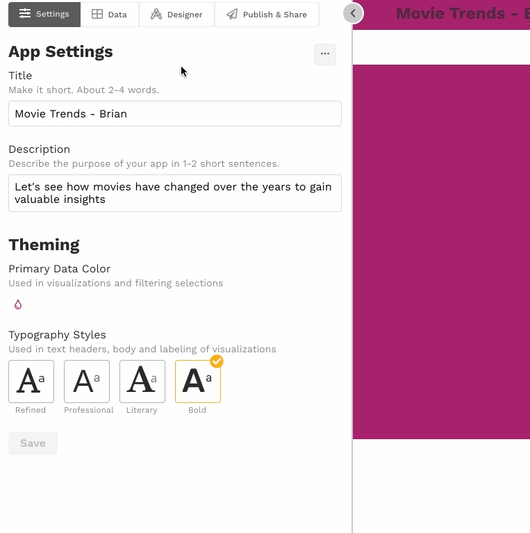
The Settings & Themes section is where you modify the basic settings for your report (title, description, icon) and the color and font themes. Here you also can delete a report and turn off the default behavior that automatically loads design changes to the draft report. Just expand the Settings & Themes section and make changes as needed.
Delete Report. Click this button to delete the report.
Icon. The icon appears on the home page and report header. Each report starts with a basic icon.
Title. The title appears on the home page and report header. Aim to keep this short, ideally 1-3 words.
Description. The description appears on the home page and report header. Here's where you add a bit more detail about your report. Aim to keep it at a sentence or a few phrases in length.
Color theme. Choose the color theme to use for your report. You can select from pre-designed color themes or customize your own. The color in the circle will be the color used in charts. The three additional colors will be used automatically as the header and section backgrounds and will be available for selection as the background color for the header, sections, and slices.
You can switch color themes at any time. If theme colors are used as backgrounds, these will be switched to the new theme colors. (If a non-theme color is used as a background, this color will not change when the theme changes.)
Font theme. Choose a font theme for your report. You can switch font themes at any time.
Editor controls. By default, changes made to the report design in the editing panel will be automatically loaded to the draft report. You can turn off that behavior by toggling off Editor controls. If Editor controls is turned off, you will have to click Reload Changes in the draft app before the changes will be loaded.
The Header Style section is where you create and style a basic header for your report. To do this, expand the Header Style section, select a header style, and adjust the header background as needed.
Click the paint drop icon in the upper right of the Header Style section to adjust the header background color or image.
Customize. The Customize button will allow you to define or modify a custom color theme. Any other section or slice using the original theme colors will change to the new colors.
Custom. The Custom button lets you add a color outside of the color theme. Using the custom color will not affect any section or slice using a theme color.
Sections are groups of slices within a report. Sections allow you to control layouts and backgrounds. To add a section, click on the plus-sign button that appears when you hover above, below, or between existing sections and select the type of chart to add to the new section. (If you're not sure which chart type, pick any of them. You can always delete it later.)
Rename the section. The new section will have a name. Click on the name to edit it.
Hide the section. When you hover on the section name, you'll see a toggle. If toggled off, the section will not display in the report.
Delete the section. To delete a section, click on the gear icon and select Delete Section.
Adjust the section layout. By default slices within a section will be stacked, one on top of the next, with no space in between. This default layout can be adjusted by clicking the Section Style dropdown.
There are commonly used layouts available in the Layout dropdown, as well as the option to define a Custom layout. Custom layouts allow you to place slices exactly where you want.
Adjust the section background. You can adjust the section background color and/or image by clicking the paint drop icon and making changes as needed.
Customize. The Customize button will allow you to define or modify a custom color theme. Any other section or slice using the original theme colors will change to the new colors.
Custom. The Custom button lets you add a color outside of the color theme. Using the custom color will not affect any section or slice using a theme color.
If you choose a dark background, Juicebox will invert the visualization and text colors automatically.
Collapse and reorder sections. To move a section up or down, hover over the section header and drag and drop the section where you want it to display. Because sections can get quite long, reordering will be easier if you collapse your sections first. To collapse a section, simply click the section header. To expand a collapsed section, click section header again.
Listening to other sections. [Coming soon.]
Slices are the basic building blocks of your report. There's a lot to say about them on the next page.
After you publish your report, it's time to invite others to view it! How this happens depends on how you are controlling access to the report.
To share a report with "Anyone with the link" access, copy the report link and share it with others as you would any other website link. Anyone who clicks on the link will see the published version of your report.
Slices are the basic building blocks of your story. Slices are added to . Each slice can have text either by itself or with media (image or video) or a .
To add a slice to an empty section, click on the section header and select the slice type from the list. To add a slice to a section that has one or more slices, click the + button where you want the new slice to appear and select the slice type from the dropdown.
Rather than adding a brand new slice, it may be easier to duplicate and modify an existing slice. To duplicate a slice, select the gear icon and then select
Data preparation is tedious and time-consuming. We get it. But unless the data is properly prepared, your report design process is likely to be frustrating and unsuccessful. Time spent preparing your data will be worth it.
Organized. Data values are organized in columns and rows in a single table. No merged cells, and no titles or notes that span multiple columns.
Summarize measures, and allow user selections to configure other charts dynamically.
A chooser chart can be used to:
Show a summary of measures
Let a user choose which measure to use in downstream charts
Let a user choose which column to use in downstream charts
- label: Detractor
condition: score <= 6
- label: Passive
condition: score <= 8
- label: Promoter
condition: <= 10- label: Under 25k
condition: <25000
- label: 25k-49k
condition: <50000
- label: 50k-99k
condition: <99000value to lookup: value to display
value to lookup: value to display
value to lookup: value to display


If you do add photos, think about how well the colors compliment the rest of your visuals.
Less is more. The more colors you add, the less you can use color to emphasize specific messages or your data you don't want to get lost.
In general, a bit of layout diversity will create a more visually interesting story, but don't forget to put yourself in your audience's shoes. They are likely less familiar with the data than you, so you don't want to create unnecessarily distracting layout changes when they are simply wanting to understand something clearly.
Reports with "Anyone with the link" access can be embedded in your site using an iframe. To do this, click the Copy Embed Code button and paste the embed code into your website:
In Squarespace you'll want to add a code block.
Wordpress lets you embed media from other sites as explained in this article.
Guidance for embedding on Wix is here.
To share a report with "Link with a password" access, copy the report invite and share it with others. Anyone who clicks the link in the invite and enters the password will gain access to the published version of your report.
To share a report with "Sign in required" access, you invite individuals to sign up using a viewer access link. You can do this by:
sending a preset email with a one-time use viewer access link to specific email addresses, or
copying the multi-use viewer access link and sharing however you like (e.g., email, text, social media)
To send a preset email with the viewer access link to one or more email addresses, select the Send an email option.
Next, enter the email addresses for the recipients and click Send. The user will receive an email that looks like this:
When the recipient clicks the Open Report button, they will be asked to sign in to your Juicebox workspace to see the app.
To share a multi-use viewer access link, select the Share a multi-use invite option.
From there, select Copy Invite button and send the invitation however you like (e.g., email, text, social media). When a recipient clicks the viewer access link in the invitation, they will be asked to sign in to your Juicebox workspace to see the report. The link can be used by multiple people and will remain usable until you regenerate the link by clicking Renew Invite.
To prevent new users from accessing the app through a previously shared viewer link, you can regenerate the link. Any previously used links will no longer allow new users to sign up. Users that have already signed up will still be able to see the app. Their access can be managed through the People view.
To regenerate the link, click the Renew Invite button.
You can change how access to a report is controlled at any time. Simply click the access control you want.

To delete a slice, select the gear icon and then select Delete.
Every slice can have text and either a chart or media (i.e., image or video). To add text to a slice, type in the draft report where you want the text to appear and use the text editor to style the text.
To add a chart to a Text slice, select the Add Chart button and select the desired chart from the list.
Until you configure your chart, the chart will display an error message.
To add an image or video to a slice, select the Add Media button and upload your own image, find an image on Unsplash, or a paste a URL to a YouTube or Vimeo video.
If you want to delete the chart or media content in a slice and go back to a Text slice, click the trash can icon.
Each slice type has a specific set of configuration options, but the following options are shared by multiple slice types:
Data Table. A dropdown will display if there is more than one data source connected to the report. The slice will use the selected data source.
Hide if no data. If turned on, the entire slice will be hidden if all data has been filtered out. If turned off, the slice will display with a message notifying the viewer that all data has been filtered out.
Selections. You can select whether user selections are allowed and, if so, how many. You can also specify how selected items will be used. The options are:
as Filters. This is the default. Selections will filter downstream slices.
as Variables. Selections will not filter downstream slices. Instead, the selected values will be saved as variables that can be used in defining ingredients.
as Filters and Variables. Selections will both filter downstream slices and be saved as variables that can be used in defining ingredients.
Variables are very powerful. Learn more here.
Display. You can select which elements of a slice should display.
Chart/Media position. If a slice has a chart (or media), there are four layout options that control how the chart (or media) will appear in relation to the slice text.
Below text
The slice text will display above the chart/media. This is the default layout.
Above text
The chart/media will display above the slice text.
Right of text
The slice text will display on the left, and the chart/media will display on the right.
Left of text
The chart/media will display on the left, and the slice text will display on the right.
Show legend. Some charts have legends. Turn this off to hide the legend.
Show notes. Some charts have notes. Turn this off to hide the notes.
Filters applied footnote. If turned on, a footnote will display in each slice showing which filters are being applied to the slice.
Each slice has a unique id that is called a "slug". Slices with text only or media will have a slug like Text1 or Text5. Slices with charts will have a slug like Table1 or Scatterplot2. You can see the slice slug in the draft app as a badge in the top-left corner of the slice on hover. Clicking the badge in the draft app will scroll the slice into view in the editing panel.
Slices with charts also show their slug in the editing panel as a badge. The slug for charts is often used in dynamic text [and other places]. To copy the slug, click the @ button next to the badge.
By default, slices have a transparent background (revealing the section background color). To adjust the slice background color, click the paint drop icon, and select the desired theme color. If you have a specific color in mind, you can enter the hex code for that color after clicking the Custom button. You can also click the Customize button to modify the color theme.
To reorder slices, drag and drop the slice where you want it to display. You can reorder slices within a section and move slices to different sections.

Complete. All the values you need are in the data.
Consistent. Data in a column should be of the same type. Number columns should contain only numbers. Date columns should contain only dates.
Clean. Number formatting, leading and trailing spaces, carriage returns, and other weird values (e.g., "#N/A" and "#ERROR") are removed.
Column headers. The first row of your data should be your column header row. Column names should have letters, spaces, or underscores, and nothing else. Each column header should be unique.
Your goal here is a single sheet containing all data organized into columns and rows, with the first row containing the column headers and each column containing values of the correct data type.
Interrogate your data early on. Do you know what the column headings mean? Do the values in the columns make sense? Are there any columns you need that are missing? If the data is not quite right, fix it before going to the next step.
As you are preparing your data, you may need to refer or revert to the original state of data. Therefore, it is very important that you make a working copy of your data and only make changes to the working copy.
Values should not span multiple columns or rows. Un-merge any merged cells.
The first row in your data should contain your column headers. Remove any rows above your column header row (e.g., report titles). Remove any other rows that do not contain data organized into columns (e.g., footnotes). If there are any sheets other than the one with your data, remove those.
Columns you don't need can be distracting during data preparation and report design, so it's a good idea to just remove them. (If you're not sure whether you need a particular column, just leave it in.)
Sometimes your data will contain rows you don't need. For example, let's say your data contains values broken out by state as well as values for the US. Because you can aggregate the state-level values to get the US values, you may not need the US records. Removing unneeded rows will simplify your ingredient definitions later on.
The first row of your data should contain your column names. Your column names should be readable, brief, and contain only letters, spaces, and underscores. For example, if the column name is Student.First.Last.Name, you could change it to Student Name; if the column name is Revenue (per Proposal), you could change it to Revenue per proposal. Your column names will be used as labels, so better column names mean less work for you when defining columns and measures. Each column name should be unique.
Consider each of your column headers. Does the column header itself contain a value that you'll want to use in your analysis? If so, you'll need to restructure your data.
A common example is data with separate columns for each year, quarter, or other time period. In other words, your data may look like this:
When it needs to look like this:
Another common example is survey data, where each survey question is a separate column. We recommend restructuring the data so that there is a Question column and a Response column, and each question response is on a separate row.
Restructuring data can be tricky, but it's a lot easier with the right tool. We recommend Alteryx Designer Cloud. If you need help, please reach out to us by clicking the blue button in the bottom right of your workspace and starting a chat.
Any column with numeric data should be free of formatting that adds thousands separators, $, %, USD, EUR, etc. You should just have numbers, either with or without decimals. A period . should be used as the decimal separator. Negative numbers should be indicated by a - before the number, e.g., -2567.4.
Numeric columns should only contain numbers or nulls. Anything else will prevent you from using the column in measures that use sum(), avg(), min(), or max() aggregation functions. You'll want to remove things like spaces, "--", "N/A", "#N/A", "NULL", and "#ERROR". While true nulls (i.e., empty cells) are ok, words like "null" or "blank" are not. A period . should be used as the decimal separator. Negative numbers should be indicated by a - before the number, e.g., -2567.4.
Date columns should only contain dates or nulls. Dates should be formatted like MM-DD-YYYY, MM/DD/YYYY, or YYYY-MM-DD. While true nulls (i.e., empty cells) are ok, words like "null" or "blank" are not.
If you want to use the Map slice, you will need to have latitude and longitude columns in your data. The latitude and longitude fields in your data must be numbers, not strings. In other words, your latitudes should look like 38.8977 rather than 38.8977° N . Likewise, your longitudes should look like -77.0365, rather than 77.0365° W.
You're almost there! Do a final check to make everything looks ok. Should null values be null? Do values contain carriage returns, leading or trailing spaces, or anything else odd? The TRIM() function is useful for dealing with large numbers of leading and trailing spaces.
Download your prepared data as a CSV file, with commas , separating the values. Give it a meaningful but brief name and save it in a location you can easily find.
Congratulations! You're now ready to load data.
A chooser chart with measures (i.e., a measure chooser) will display a high-level summary of measures. The selection made in a measure chooser can be used as a dynamic measure in one or more downstream charts, allowing for user-driven exploration.
select Chooser from the chart list
select the measures you want to add in the order you want them displayed
add slice text (optional)
A chooser chart with dimensions (i.e., a dimension chooser) lets users select one dimension from a group of dimensions for use as a dynamic dimension in one or more downstream charts, allowing for user-driven exploration.
A dimension chooser slice should always be connected to at least one downstream chart. See the dynamic dimensions section below.
select Chooser from the chart list
select the dimensions you want to add in the order you want them displayed
add slice text (optional)
click Save changes
Chooser slices are particularly powerful when slices further down the report refer to the selections in the chooser.
To reference the selection made in a chooser slice:
Create a dimension chooser or measure chooser using the instructions in the sections above
In a downstream slice, select the chooser's slice slug in the column dropdown and/or measure dropdown
Here's how to make your charts dynamic:
After making your chart dynamic, you may want to make your slice text dynamic as well. To learn how, go here.


Action
Viewer
Editor
Admin
Owner
View specific reports that they've been invited to
✔️
N/A
N/A
N/A
Invite viewers to specific reports
✔️
✔️
✔️
Viewers can view the reports they've been given access to through an access link. They cannot see reports they have not been given access to and they cannot create new reports or edit reports.
Editors can view all reports, edit all reports, and create new reports.
Admins can view all reports, edit all reports, create new reports, and manage user roles and report access in the People page.
Each workspace has at least one owner. Owners can do everything admins can do. In addition, owners can adjust workspace settings and subscription and payment information.
Workspace owners and admins can manage users through the People page. At the top of the workspace home page, owners and admins will see a People button.
Clicking the People button will open the People page.
The People page lists each workspace user as well as the number of reports the user has access to, the user's role, when the user last logged in, and when the user first signed up. You can search for users using the search bar at the top of the People page. You can sort the values in a column by clicking the column header.
To change a user's role, click on the user's name in the list of users. A modal will open where you can select a different role for the user from a dropdown.
While owners, admins, and editors can access all reports in a workspace, viewers can only view the reports they have been given access to. To modify a viewer's reports, click on the viewer's name from the list of users. A modal will open where you can modify the viewers report access.
To give the viewer access to all reports in the workspace, select All Reports. To give the user access to specific reports in the workspace, select Customized and then tick the boxes for each report the viewer should have access to.
To limit the data that a user can see, you can set data permissions. By default, data permissions are set to {}, which gives the user access to all records. If a permissions object is added for the user, then the data will be filtered to show only the permitted records. For example, the permissions object below will only display records where customer_id = "30005". Information about setting up data permissions can be found here.
To delete a user, hover over the user you wish to delete and select the trash can icon ().


You can request content from Juicebox tables in embedded apps and check if the report is fully loaded.
You can request the current filtered state of a Juicebox table. This can return either a downloadable file for your user or a json object that can be used to for other automations.
Juicebox uses the javacsript api to safely allow cross origin communication between window objects. Juicebox listens for postMessage events. Juicebox filters postMessage messages to an allowed origin page (currently all Juicebox servers). Your Juicebox representative can ensure your site or test site is whitelisted.
The messages can call is-report-ready, export-data, or download-data.


View all reports
✔️
✔️
✔️
Edit all reports
✔️
✔️
✔️
Create new reports
✔️
✔️
✔️
Manage users
✔️
✔️
Manage workspace settings
✔️
✔️
Change subscription
and payment info
✔️


In order to export or download data, you must confirm that the Juicebox report is fully loaded. To do so, you can poll the Juicebox report with is-report-ready. A javascript sample looks like this.
Your page should register an event listener to receive the callback.
Once the report is fully loaded, you can request downloadable data. This will return a time-limited url that can be used to download the content. The download data request looks like:
In this example, the Juicebox app is iframed in an iframe with id #juicebox-iframe. Table1 is the identifier for the table you want to download.
Alternatively, once a report is fully loaded, use export-data to return data from a table as a json object.
As with downloading data, the Juicebox app is iframed in an iframe with id #juicebox-iframe. Table1 is the identifier for the table you want to export.
The response will be a json object containing the following keys.
columns: A list of columns objects in the order that they appear with column metadata. The properties of each column are:
name: The display name of the column as it appears in the header of the table.
field: The property on each row that contains the value.
format: A juicebox formatting string. For dates and datetimes, these correspond to strftimes. For numbers, the formats are an extension of d3.format which supports different formats for positive, negative, null, and zero values, as well as prefix and suffix support.
dtype: The datatype of the column. One of the following
str: String
num: Numeric
data: A list of rows. Each row will contain all the columns in the column list.
Here is a sample response:
download-data or export-data request may take several seconds to return. Your page should register an event listener to receive the callback containing the data, like this example. The callback will be a message event with origin matching the Juicebox server.
This html file provides a sample implementation of how to communicate with a Juicebox app in an iframe. You should view the source of this file to see how the communication works.
To use this file, you'll need:
Your juicebox servername, typically "https://MYSITE.myjuicebox.io" which you will enter in the site URL.
A Juicebox Access View key. Your Juicebox representative can help you get this.
Click "Embed It!" to first create an embedded Juicebox iframe.
Next you need the slug of a table in the app you've embedded.
Choose either "Export Data" or "Download Data".
Choosing "Export Data" will log the returned data in the browser console.
Choosing "Download Data" will perform the download.
Allow deleting redis cache for any app that the requesting user can modify.
Token-based authentication with required prefix "Token"
^\w+(:\w+)?$No response body
No response body
No content
List Access Views
Token-based authentication with required prefix "Token"
List Access Views
Token-based authentication with required prefix "Token"
Can this access key be used
The number of times this access key CAN BE used. 0=unlimited uses
The number of times this access key HAS BEEN used
The app this key is granting access to
Get an Access View
Token-based authentication with required prefix "Token"
^\w+$Modify an Access View
Token-based authentication with required prefix "Token"
^\w+$Can this access key be used
The number of times this access key CAN BE used. 0=unlimited uses
The number of times this access key HAS BEEN used
The app this key is granting access to
Deleting an access view will set the is_active flag to False.
Token-based authentication with required prefix "Token"
^\w+$The access view has been set to inactive.
The access view has been set to inactive.
No content
Modify an Access View
Token-based authentication with required prefix "Token"
^\w+$Can this access key be used
The number of times this access key CAN BE used. 0=unlimited uses
The number of times this access key HAS BEEN used
The app this key is granting access to
List Access Views
Token-based authentication with required prefix "Token"
^\w+$For backward compatibility with some client's integrations that have hardcoded 200, we remap status 201 to 200.
Serializer class used to validate a username and password.
'username' is identified by the custom UserModel.USERNAME_FIELD.
Returns a JSON Web Token that can be used to authenticate later calls.
Get a list of apps, new apps are created using the Juicebox editor.
Token-based authentication with required prefix "Token"


Here are the relevant API calls
To embed Juicebox apps in your own website, follow these steps.
Request a JWT token as a client admin user. This token can be reused.
Request details about what Juicebox apps are available. This will provide you an app id for the app you want to embed.
Create a Juicebox user with the appropriate
Before you start creating your Juicebox data story, you’ll want to make sure you have a good understanding of your audience’s needs. Everyone who will be using your data story or report has a role in the organization and associated responsibilities. The more your data story or report can help them fulfill those responsibilities, the more value it will have. To do that, make sure you understand your ideal user. Consider these questions:
Who is your ideal user?
function checkIfReportIsReady() {
const isReady = event => {
if (event.data.type == "is-report-ready") {
window.removeEventListener("message", isReady);
if (event.data.data === true) {
// Enable or perform the download or export action
} else {
setTimeout(checkIfReportIsReady, 500);
}
}
};
window.addEventListener("message", isReady, false);
document.getElementById("juicebox-iframe").contentWindow.postMessage(
{ type: "is-report-ready" }, "*"
);
};window.addEventListener("message", event => {
// Ideally you want to check where the event originated from before responding to it.
// But for this demo page it has been commented out.
// if (event.origin !== "http://localhost:8000") {
// console.log("Do not trust the sender of this message");
// return;
// }
console.log("Sender is trusted", event);
console.log("Received event", event.data, "from", event.origin);
}, false);
});document.getElementById("juicebox-iframe").contentWindow.postMessage({
type: "download-data",
"download-data": {
slug: Table1
}
});document.getElementById("juicebox-iframe").contentWindow.postMessage({
type: "export-data",
"export-data": {
slug: Table1
}
});{
"columns": [
{
"name": "Campaign Start",
"field": "Campaign_Start",
"format": "%b %-d, %Y",
"dtype": "datetime"
},
{
"name": "Campaign",
"field": "Campaign",
"format": null,
"dtype": "str"
},
{
"name": "Total Delivered",
"field": "metric_Total_Delivered",
"format": ",.0f;,.0f;,.0f;\"---\"",
"dtype": "num"
},
],
"data": [
{
"Campaign_Start": "2023-10-22T00:00:00",
"Campaign": "Fall Sale",
"metric_Total_Delivered": 500,
},
{
"Campaign_Start": "2023-12-22T00:00:00",
"Campaign": "Winter Sale",
"metric_Total_Delivered": 1254,
}
]
}window.addEventListener("message", event => {
// Ideally you want to check where the event originated from before responding to it.
// But for this demo page it has been commented out.
// if (event.origin !== "http://localhost:8000") {
// console.log("Do not trust the sender of this message");
// return;
// }
console.log("Sender is trusted", event);
console.log("Received event", event.data, "from", event.origin);
}, false);
date: Date, the values will be formatted as ISO-8601 formatted strings
datetime: Datetimes, the values will be formatted as ISO-8601 formatted strings
bool: Boolean values
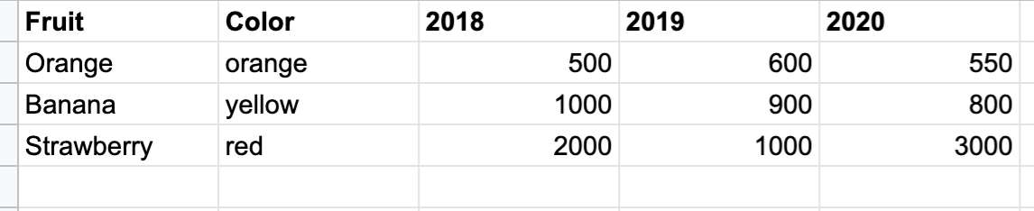
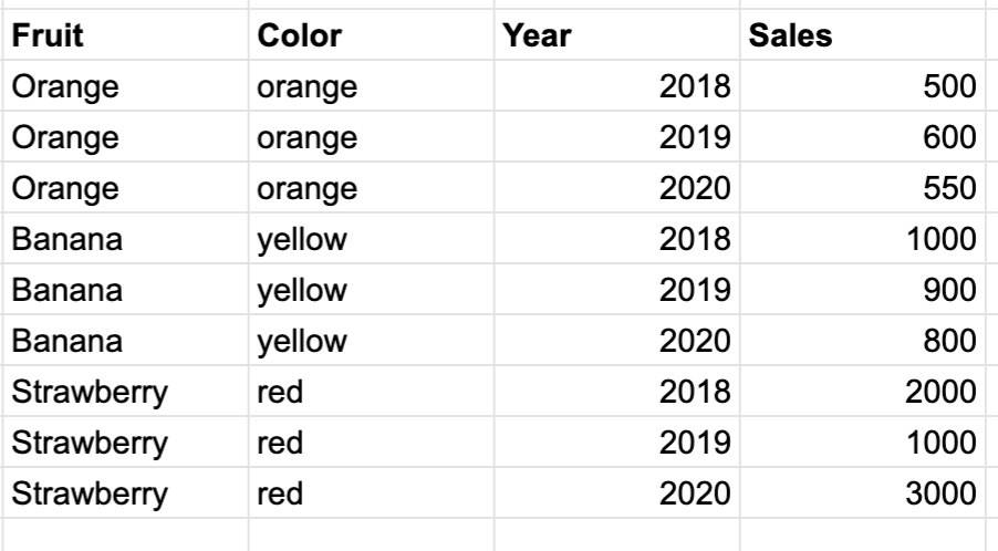
{
"created": "2025-12-14T06:07:53.569Z",
"modified": "2025-12-14T06:07:53.569Z",
"key": "text",
"is_active": true,
"allowed_uses_cnt": 1,
"usages_cnt": 1,
"expires_at": "2025-12-14T06:07:53.569Z",
"data_permissions": {
"ANY_ADDITIONAL_PROPERTY": "anything"
},
"selections": {
"ANY_ADDITIONAL_PROPERTY": "anything"
},
"show_header": true,
"language_code": "text",
"app": "text"
}{
"created": "2025-12-14T06:07:53.569Z",
"modified": "2025-12-14T06:07:53.569Z",
"key": "text",
"is_active": true,
"allowed_uses_cnt": 1,
"usages_cnt": 1,
"expires_at": "2025-12-14T06:07:53.569Z",
"data_permissions": {
"ANY_ADDITIONAL_PROPERTY": "anything"
},
"selections": {
"ANY_ADDITIONAL_PROPERTY": "anything"
},
"show_header": true,
"language_code": "text",
"app": "text"
}DELETE /api/v1/jb/apps/{id}/clear_cache/ HTTP/1.1
Host:
Authorization: YOUR_API_KEY
Accept: */*
GET /api/v1/access_views/ HTTP/1.1
Host:
Authorization: YOUR_API_KEY
Accept: */*
[
{
"created": "2025-12-14T06:07:53.569Z",
"modified": "2025-12-14T06:07:53.569Z",
"key": "text",
"is_active": true,
"allowed_uses_cnt": 1,
"usages_cnt": 1,
"expires_at": "2025-12-14T06:07:53.569Z",
"data_permissions": {
"ANY_ADDITIONAL_PROPERTY": "anything"
},
"selections": {
"ANY_ADDITIONAL_PROPERTY": "anything"
},
"show_header": true,
"language_code": "text",
"app": "text"
}
]POST /api/v1/access_views/ HTTP/1.1
Host:
Authorization: YOUR_API_KEY
Content-Type: application/json
Accept: */*
Content-Length: 244
{
"is_active": true,
"allowed_uses_cnt": 1,
"expires_at": "2025-12-14T06:07:53.569Z",
"data_permissions": {
"ANY_ADDITIONAL_PROPERTY": "anything"
},
"selections": {
"ANY_ADDITIONAL_PROPERTY": "anything"
},
"show_header": true,
"language_code": "text",
"app": "text"
}GET /api/v1/access_views/{key}/ HTTP/1.1
Host:
Authorization: YOUR_API_KEY
Accept: */*
{
"created": "2025-12-14T06:07:53.569Z",
"modified": "2025-12-14T06:07:53.569Z",
"key": "text",
"is_active": true,
"allowed_uses_cnt": 1,
"usages_cnt": 1,
"expires_at": "2025-12-14T06:07:53.569Z",
"data_permissions": {
"ANY_ADDITIONAL_PROPERTY": "anything"
},
"selections": {
"ANY_ADDITIONAL_PROPERTY": "anything"
},
"show_header": true,
"language_code": "text",
"app": "text"
}PUT /api/v1/access_views/{key}/ HTTP/1.1
Host:
Authorization: YOUR_API_KEY
Content-Type: application/json
Accept: */*
Content-Length: 244
{
"is_active": true,
"allowed_uses_cnt": 1,
"expires_at": "2025-12-14T06:07:53.569Z",
"data_permissions": {
"ANY_ADDITIONAL_PROPERTY": "anything"
},
"selections": {
"ANY_ADDITIONAL_PROPERTY": "anything"
},
"show_header": true,
"language_code": "text",
"app": "text"
}DELETE /api/v1/access_views/{key}/ HTTP/1.1
Host:
Authorization: YOUR_API_KEY
Accept: */*
PATCH /api/v1/access_views/{key}/ HTTP/1.1
Host:
Authorization: YOUR_API_KEY
Content-Type: application/json
Accept: */*
Content-Length: 244
{
"is_active": true,
"allowed_uses_cnt": 1,
"expires_at": "2025-12-14T06:07:53.569Z",
"data_permissions": {
"ANY_ADDITIONAL_PROPERTY": "anything"
},
"selections": {
"ANY_ADDITIONAL_PROPERTY": "anything"
},
"show_header": true,
"language_code": "text",
"app": "text"
}GET /api/v1/access_views/{key}/usage/ HTTP/1.1
Host:
Authorization: YOUR_API_KEY
Accept: */*
[
{
"data_permissions": {
"ANY_ADDITIONAL_PROPERTY": "anything"
},
"selections": {
"ANY_ADDITIONAL_PROPERTY": "anything"
},
"app_slug": "text",
"show_header": true,
"language_code": "text",
"timestamp": "2025-12-14T06:07:53.569Z"
}
]POST /api/v1/jb/api-token-auth/ HTTP/1.1
Host:
Content-Type: application/json
Accept: */*
Content-Length: 34
{
"password": "text",
"email": "text"
}GET /api/v1/jb/apps/ HTTP/1.1
Host:
Authorization: YOUR_API_KEY
Accept: */*
[
{
"client_id": "text",
"created_at": "2025-12-14T06:07:53.569Z",
"description": "text",
"footer_html": "text",
"help_html": "text",
"id": "text",
"in_maintenance": true,
"invitation_body": "text",
"invitation_subject": "text",
"label": "text",
"maintenance_message": "text",
"metadata": {
"ANY_ADDITIONAL_PROPERTY": "anything"
},
"package_info": {
"ANY_ADDITIONAL_PROPERTY": "anything"
},
"raw_config": {
"ANY_ADDITIONAL_PROPERTY": "anything"
},
"show_footer": true,
"show_help": true,
"slug": "text",
"usage": {
"ANY_ADDITIONAL_PROPERTY": "anything"
},
"users": [
1
]
}
]{
"token": "text"
}Request an embed url for this user to see the app.
Serve the embed url in an iframe on your site.
Let's look at the details for each of these steps.
GET https://{domain}.myjuicebox.io/api/v1/jb/api-token-auth/
Request a token that represents a client admin user. This user has permissions to perform user setup and request embed urls for your Juicebox account.
domain*
String
Your Juicebox domain
Content-Type*
String
application/json
email*
String
A client admin email
password*
String
A client admin password
Find the app you want the user to be able to see.
GET https://{domain}.myjuicebox.io/api/v1/jb/apps/
Get a list of all available apps. Juicebox apps have both a published and draft version. The draft version will only be visible to editors and admins.
If the number of available apps exceeds 100, the list of apps will be paginated. Response headers will contain the following values.
X-Count The total number of apps available.
X-PageThe current page number
X-PageSize The number of apps on each page.
X-Next A link to fetch the next page of data. This will be "None" when on the last page of data.
X-Previous A link to fetch the previous page of data. This will be "None" when on the first page of data.
domain*
String
Your Juicebox domain
Authorization*
String
"JWT {token}"
A JWT token for a client admin user.
Create a user with the Juicebox Data Permissions and app access you desire.
POST https://{domain}.myjuicebox.io/api/v1/jb/users/
domain*
String
Your Juicebox domain
Authorization*
String
"JWT {token}"
A JWT token for a client admin user.
email*
String
The email address of the user you want to create.
extra
Json
A Juicebox Data Permissions object to control what this user can see. If omitted, the user will not have any data permissions applied.
first_name
String
The user's first name
last_name
String
The user's last name
Now you can request an app embed url.
POST https://{domain}.myjuicebox.io/api/v1/jb/apps/{appid}/embed/{email}/
For security, the default duration of an embed url is 60 seconds. It can only be loaded once. It can be regenerated as many times as needed.
domain*
String
Your Juicebox domain
appid*
String
An app id for an app this user has access to.
email*
String
An email for a user that has already been created.
show_header
String
If this parameter is present in the query string, the application header (which allows export as png and pdf) will be displayed.
Turn off display of the header with ?show_header=0
show_footer
String
If this parameter is present in the query string, the application footer will be displayed.
Turn off display of the header with ?show_footer=0
Authorization*
String
"JWT {token}"
A JWT token for a client admin user.
Serving the app in an iframe. To embed the app in your site, use the following html. You can vary height and width as appropriate for your site.
What role do they have in the organization?
What makes them successful in that role?
What do they already know about the content of your data story?
What are some ways your data story will influence them?
A good place to start in designing your data story is with understanding the personality of your audience. Our data personality framework gives you a way to understand your target audience.
Like a Myers-Briggs personality test, but for data users, this framework will give you a sense of what you need to emphasize in your data story.
Understanding your audience and their needs is the starting point to gather thoughts for a data story. Now you want to organize those thoughts. One of the best ways to think through your story is to begin by writing. Writing will help you:
Clarify the structure;
Articulate the language and terminology;
Check the flow and transitions;
Test the attention span of your audience.
You don’t need to write an essay; start with a story abstract. A story abstract provides the highest-level description of the key elements of your story. Do you remember those Mad Libs games where you filled in the blanks with nouns, verbs, and adjectives? Here’s a Mad Libs-style template for your data story:
You’ll want to answer the following questions:
What is the topic of your data story?
Who is your target audience?
What are the key questions you want to help them answer?
What are the key measures that will help answer these questions?
What dimensions or breakouts of the data will support the analysis?
What types of insights should they learn from the data?
What actions will your audience take based on these insights?
How will these actions impact the organization’s goals?
How will these actions impact the audience’s personal goals?
The choice of measures (or metrics) can make all the difference in your data story. Measures are your characters. A performance measure represents the thing you want to see improved in your organization, or the thing you want to see reduced or eliminated. It is the thing you want to track how it is changing and why it is moving up or down.
There are four factors to consider when you decide what is the right measure to feature in your data story:
Does the measure have a common interpretation across your audience? In other words, will your audience understand what the measure represents in their world.
Is the measure something that your audience can take action on? The best kinds of measures have clear implications about what should be done as the measure moves up or down.
Does the measure derive from accessible, credible data? Sometimes the most valuable and obvious measures are frustratingly hard to track or unmeasurable.
Can the measure be calculated in a simple, transparent way? Complex measures based on obscure calculations often lead to confusion in the data-driven discussion that you are trying to enable.
Data stories share a similar structure to traditional narratives. The three-act play structure that we are all familiar with sets out a problem (Act 1), allows the characters to change and grow through conflict (Act 2), then reaches a resolution (Act 3). Data stories can take your audience through a similar journey:
Context. Here you are helping your audience understand the background, why the data is important, where it comes from, and what key questions you want to answer.
Heart. Guided exploration is the core of your data story. This is where you provide the visualizations to interact with the data. You want to provide enough flexibility to answer key questions while maintaining focus on the data and insights that matter most.
Actions. The last section of your data story should emphasize the detailed data and results that are most actionable for your audience. This may be a list of individual items or a summary of what you’ve learned from the data.
The following diagram shows how these three stages connect to traditional storytelling.
We want to provide a short checklist of items to evaluate whether you’ve considered important design choices with your data story.
Before your reader dives into the data, you want to set the context. How? At the top of your story, add a slice that gives a title, describes the data, even tells people what kinds of questions they can answer.
Juicebox is designed to do more than just show data visualizations. You can use text to explain what’s being shown in the data. This text could include:
Titles for the visualizations to explain the content. Often the title can be expressed as the question that is answered by the visualization.
Explanations or insights based on the visualization. Is there something you want your audience to see in the data? Tell them. The text areas in Juicebox are an opportunity to be in conversation with your audience.
So much to show...so little attention. Recognize that your audience may be distracted or have a short attention span. Focus is critical in a good data story. This can mean:
Show fewer measures.
Provide fewer filters or dimensional breakouts
Reduce the number of visualizations to get to your key messages more quickly
Let a trusted colleague review your data story and ask them to identify anything that they think isn’t totally necessary to get your message across. If it's not necessary, it should be removed. The cost of more content is high when you risk losing the attention of your audience.
By default, Juicebox will layout your sections and slices vertically. In this way, your audience can read through the content from top to bottom and your filtered selections will pass down the page.
However, sometimes it will make sense to take advantage of the alternative layout options:
Within sections, you can layout slices horizontally. Horizontal layouts will help put more information on the screen at once. They can be useful for displaying groups of measures side-by-side. You might also try laying out a bar chart and trend chart horizontally to visually connect the data in those two charts. Generally, it isn’t a good idea to show more than two or three slices horizontally.
Within slices, you can also choose the layout of the text relative to a visualization. Placing the text to the left of the visualization is an effective way to make your data story easier to read.
A data story will often have multiple sections, perhaps reflecting the three-parts of a story. In Juicebox, you can make visual breaks between sections using color. Find the color selector on the top of each section on the Design tab. By visually breaking up your sections, you’ll help your readers understand where the logical breaks are in your story.
Getting your data ingredient labels right is a small and important design choice. Often when you load data into Juicebox, the data columns may not be written in a way that is easy for your audience to understand. We’ve made it easy in Juicebox to change those labels. What is the simplest and clearest way to describe the data ingredient? Will your audience understand any abbreviations or acronyms you are using?


{
"token": {client admin token}
}<iframe
title="{app title}"
src="{url}"
height="650px"
width="100%"
frameborder="0"
sandbox="allow-scripts allow-downloads allow-same-origin allow-forms allow-popups">
</iframe>apps
A list of app ids that this user is allowed to see.
You can perform mathematical operations with data fields and constants. For example, if you have sale_amount and cost_amount in your data, you can add a Profits dimension like so:
If you divide by zero, you’ll get a null.
Conversion functions change the value for a field. It might change to a different type or to a different time period.
Function
Examples
Round to the nearest week (requires a date field)
week(sales_date)
Round to the nearest month (requires a date field)
month(sales_date)
Round to the nearest quarter (requires a date field)
quarter(sales_date)
Round to the nearest year (requires a date field)
year(sales_date)
Convert a numeric value to a string
string(zipcode)
When using the datediff and extract functions, you can supply a datepart. This will determine the units that are counted or extracted. Possible values are
day
week
This begins on Sunday
week(weekday)
This date part begins on weekday. Valid weekdays are "sunday", "monday", "tuesday", "wednesday", "thursday", "friday", and "saturday".
month
quarter
You can use + to concatenate text data fields together. For example, you can concatenate first_name and last_name to create a Full name dimension.
You must use double quotes in field expressions to define string constants. Single quotes will not work.
If you want to concatenate fields that do not have a Text data type, you'll need to first convert the field to a string using the conversion function string(). For example, if you want to concatenate address, state, city, and zip together, but zip is not a string, you'll need to use string(zip).
Aggregation functions are used in measure ingredients to perform a calculation across multiple rows. If no aggregation function is provided for a measure ingredient, sum() will be used.
Function
Examples
Sum
sum(sales_dollars) or sum(revenue - expenses)
Minimum
min(age)
Maximum
max(age)
Average
avg(home_value)
Count
count(student_name) or count(*)
When you upload a CSV file, percentiles and medians are calculated as approximate values. The statistically exact value may be slightly different.
You can combine multiple aggregation functions together. For example, if you have sales_amount and salesperson_id in your data, you can add a Sales per Salesperson measure using the sum() and count_distinct() aggregation functions together like so:
You can add conditional logic to formulas. Conditions are true/false statements that can be expressed in your formulas. Here are some examples of conditions:
To use conditions in formulas, use the if function. This function contains pairs of conditions and values. A final value is used if none of your conditions match. Here is the if function pattern:
Here are examples for formulas that use the if function:
Conditions are defined as [field] [comparison] [values]. These comparisons can be ANDed or ORed together.
Conditions
Examples
Greater than a number
sales > 20 or sales > 20.5
Greater than or equal to
sales >= 20
Equal to a number or a string (strings must be surrounded by double quotes)
age=20 or state="Tennessee"
Not equal to a number or string
age != 20 or state != "Tennessee"
Checking if a value is null
state IS NULL


sales > 1000
# This uses a list
state IN ("Georgia", "Tennessee", "Virginia", "Texas", "South Carolina")
# You can use ANDs and ORs
sales > 1000 OR state = "Texas"
# Use IS NULL to compare for missing values
name IS NULLif([condition1], [value1], [condition2], [value2], …, [else_value])# A simple if
sum(if(state="Texas", sales_dollars, 0.0))
# Multiple condition/value pairs
sum(if(state="Texas", sales_dollars*0.08, state="Georgia", sales_dollars*0.07, state="Tennessee", sales_dollars*0.0925, sales_dollars*0.055))
# You can use if() functions for both dimensions and measures
if(last_name IS NULL, first_name, first_name + " " + last_name)Convert a string value to an integer
int(age)
Calculate an age at the current date.
age(birth_date)
Calculate the difference between dates
datediff(end_date, start_date)
Extract a component of a date
extract(YEAR, birth_date)
Return the last date in a period
lastday(sales_date, MONTH) note: this can be used only on bigquery and snowflake databases
year
isoweek
Uses ISO 8601 week boundaries. ISO weeks begin on Monday
isoyear
Uses ISO 8601 week-numbering year boundary.
dayofweek (extract function only)
Sunday=1, Monday=2, etc.
dayofyear (extract function only)
Count only distinct items
count_distinct(student_name)
Median
median(sales_dollars)
Percentiles expressed as percentileN where N can be between 1 and 99.
percentile1(age) or percentile75(sales_dollars)
Percentiles can also be expressed as an expression and a desired percentile.
percentile(age, 0.25)
Standard Deviation. Calculates the sample standard deviation for an expression.
stddev(age)
Checking if a value is in a list of values
state IN ("TN", "GA", "FL")
Checking if a value is True or False
flag = "True"or flag = "False"
Comparing dates.
sales_date BETWEEN "ONE WEEK AGO" and "TODAY" or sales_date BETWEEN "2020-01-01" AND "2020-06-30"
Intelligent date ranges (use PREVIOUS, THIS, or NEXT to define an offset and DAY, MONTH, MTD, QTR, YEAR, or YTD to define the period).
sales_date IS THIS MONTH or sales_date IS LAST MONTH
ANDing two conditions
sales > 1000 AND sales_date IS THIS MONTH
ORing two conditions
sales > 1000 OR sales IS NULL
Check if a value contains a string using % as a wildcard. If % is not provided, it will be inserted at the beginning and end of the value. LIKE is case-sensitive, ILIKE is case-insensitive.
state LIKE "Te%"
state ILIKE "m%"


To control how numbers are displayed in the report, you can specify a format. For example, let's say you have a dimension called Budget. Representative values for Budget in your data are 3231.447 and 0.5264. You probably do not want to display the unformatted values in your report. Therefore, you will want to specify a number format in the ingredient editor.
The format specified in the ingredient editor will determine how the value will display in your report. The following standard formats are available:
format label
d3 equivalent
How value3231.447 will display
If you want to apply a number format other than one in the dropdown, you can do so by entering the custom format in the Number format box. For example, let's say you want to display Average Rating with 1 decimal. You can do this by entering .1f, like so:
Number formats in Juicebox have the following parts
Every part of the number format is optional except for the positive_format . If only the positive_format is given, it will be used for all numbers.
Prefix can be any text that appears before the number, while suffix will appear after the number. They must be between double quotes. Prefix and suffix support a special command pluralize(singular, plural) which chooses between two strings. If the number being formatted is one, the singular value will be displayed, otherwise the plural value will be displayed.
This format documentation is adapted from .
Formats have the following parts:
You can optionally provide extra formats for negative, zero, or null values. The positive_format will be used when other formats aren’t provided.
[fill[align]]
The fill can be any character. The presence of a fill character is signaled by the align character following it, which must be one of the following:
[sign]
The sign can be:
[symbol]
The symbol can be
[0]
The zero (0) option enables zero-padding; this implicitly sets fill to 0 and align to =. The width defines the minimum field width; if not specified, then the width will be determined by the content. The comma (,) option enables the use of a group separator, such as a comma for thousands.
[width] and [precision]
Depending on the type, the precision either indicates the number of digits that follow the decimal point (types f and %), or the number of significant digits (types , e, g, r, s and p). If the precision is not specified, it defaults to 6 for all types except (none), which defaults to 12. Precision is ignored for integer formats (types b, o, d, x, X and c).
The available type values are:
This format will show a certain number of digits. If the number is in the thousands, it wil be
.Ns formats display numbers with N digits of precision. This is a good way to display numbers that differ greatly in size.
.Nf displays numbers with a N digits after the decimal place.
Starting your format with a comma will put commas between 000s.
Using "ordinal" as a format will
1 student
either decimal or exponent notation, rounded to significant digits.
r
decimal notation, rounded to significant digits.
p
multiply by 100, round to significant digits, and then decimal notation with a percent sign.
b
binary notation, rounded to integer.
o
octal notation, rounded to integer.
d
decimal notation, rounded to integer.
x
hexadecimal notation, using lower-case letters, rounded to integer.
X
hexadecimal notation, using upper-case letters, rounded to integer.
c
converts the integer to the corresponding unicode character before printing.
(none)
like g, but trim insignificant trailing zeros.
0.0
.2s
0.9123
0.91
.2s
-0.9123
-0.91
.2s
0
0.00
.2s
0.00000000001
0.00
.1s
0.9123
0.9
.1s
0
0.0
.1s
0.00000000001
0.0
.2s
0
0.00
.1s
0.1234567
0.1
.1s
1.234567
1
.1s
12.34567
10
.1s
123.4567
100
.1s
1234.567
1K
.1s
12345.67
10K
.1s
123456.7
100K
.1s
1234567
1M
.1s
12345678
10M
$.1s
12345678
$10M
.1s
123456789
100M
.1s
1234567891
1B
.1s
12345678912
10B
.3s
0.1234567
0.123
.3s
1.234567
1.23
$.3s
1.234567
$1.23
.3s
12.34567
12.3
.3s
123.4567
123
.3s
1234.567
1.23K
.3s
12345.67
12.3K
$.3s
12345.67
$12.3K
.3s
123456.7
123K
.3s
1234567
1.23M
.3s
12345678
12.3M
.3s
123456789
123M
.3s
1234567891
1.23B
.3s
12345678912
12.3B
.1s
0.9
0.9
.1s
-0.9
-0.9
.1s
0
0.0
.1s
100
100
.1s
1100
1K
.1s
10000
10K
,.3s
0.000123
0.000
,.3s
0.001234
0.001
,.2s
0.012345
0.01
,.4s
0.12345
0.1235
,.3s
1.2345
1.23
,.3s
123
123
,.2s
12345.56
12K
,.2s
1234567
1.2M
,.2s
1234567890
1.2B
,.2s
123456789012
120B
,.2s
1234567890123
1.2T
.2f
1203
1203.00
.2f
-1203
-1203.00
,.2f
-1203
-1,203.00
Note
Note the commas between the 000s caused by the starting ‘,’
.2f
null
0.00
.2f
NaN
NaN
.1%
.12345
12.3%
.2%
.12345
12.34%
.2%
123.45
12345.00%
,.2%
123.45
12,345.00%
1,234 days from now
,.0f" days from now";|,.0f|" days ago";"today";"--unknown--"
-1234
1,234 days ago
,.0f" days from now";|,.0f|" days ago";"today";"--unknown--"
0
today
,.0f" days from now";|,.0f|" days ago";"today";"--unknown--"
null
–unknown–
1.2K
4th
ordinal
23
23rd
ordinal
24
24th
ordinal
100
100th
ordinal
101
101st
How value 0.5264 will display
# 2 Decimals
,.2f
3,231.45
0.53
# Rounded
,.0f
3,231
1
# 3 Sig figs
.3s
3.23K
0.526
$ 2 Decimals
$.2f
$3,231.45
$0.53
$ Rounded
$,.0f
$3,231
$1
$ 3 Sig figs
$.3s
$3.23K
$0.526
% 2 Decimals
,.2%
323,144.70%
52.64%
% Rounded
,.0%
323,145%
53%
Format
Number
Result
"Total sales: ".0f
1234
Total sales: 1234
,.0f" days until Christmas"
1234
1,234 days until Christmas
,.0f"pluralize( student, students)"
4
4 students
,.0f"pluralize( student, students)"
Align character
Description
>
Forces the field to be right-aligned within the available space. (Default behavior).
<
Forces the field to be left-aligned within the available space.
^
Forces the field to be centered within the available space.
=
like >, but with any sign and symbol to the left of any padding.
Sign character
Description
-
nothing for positive and a minus sign for negative. (Default behavior.)
+
a plus sign for positive and a minus sign for negative.
(
nothing for positive and parentheses for negative.
SPACE
a space for positive and a minus sign for negative.
Symbol character
Description
$
apply currency symbols per the locale definition.
#
for binary, octal, or hexadecimal notation, prefix by 0b, 0o, or 0x, respectively.
Format
Description
f
fixed point notation.
s
decimal notation with an SI prefix, rounded to significant digits.
Note
Juicebox changes numbers lower than 1 to be formatted with equivalent f notation.
%
multiply by 100, and then decimal notation with a percent sign.
ordinal
Display as an ordinal number (like 1st, 2nd, 3rd)
e
exponent notation.
Format
Number
Result
.1s
0.9241
0.9
.1s
0.9123
0.9
.1s
0
0.0
.1s
Format
Number
Result
.2s;.3s
1234
1.2K
.2s;.3s
-1234
-1.23K
.2s;.3s;.4s
0
0.0000
,.0f" days from now";|,.0f|" days ago";"today";"--unknown--"
Format
Number
Result
\|.2s\|
1234
1.2K
\|.2s\|
-1234
1.2K
.2s;"negative "\|.3s\|
-1234
negative 1.23K
Note
Negative formats can have their own prefixes.
.2s;\|.3s\|
Format
Number
Result
ordinal
1
1st
ordinal
2
2nd
ordinal
3
3rd
ordinal


1
g
0.00000000001
1234
1234
4
"<prefix>"<positive_format>;<negative_format>;<zero_format>;<null_format>"<suffix>"[[fill]align][sign][symbol][0][width][,][.precision][type]AI-enhanced results.
Ability to add and manage multiple pages within the same report, giving more flexibility in organizing reports.
Ability to hide or show different sections to different users.
Additional advanced report design options available through our report design consulting services.
(release 4.101)
🎁 What's new?
Formula editing panel: New dedicated interface for creating and editing formulas with improved usability
Bug fixes & other improvements
Fixed issue where dynamic table column widths
Resolved persistent tooltip display issues in scatterplot
(release 4.100)
Bug fixes & other improvements
Fixed an error impacting uploading images to Headline slice
Improved debug modal
(release 4.99)
🎁 What's new?
New centralized debug modal for all slices accessible via the app header and slice configuration panel
Bug fixes & other improvements
Various minor improvements to user experience and performance
(release 4.98)
Bug fixes & other improvements
Various minor improvements to user experience and performance
(release 4.97)
Bug fixes & other improvements
Home (Reports) page performance improvements
(release 4.96)
Bug fixes & other improvements
Improved the debug modal
Improved table slice configuration options, including resizable columns
Improved ingredient editor panel
(release 4.95)
Bug fixes & other improvements
Various minor improvements to user experience and performance
(release 4.94)
Bug fixes & other improvements
Various minor improvements to user experience and performance
(release 4.93)
Bug fixes & other improvements
Various minor improvements to user experience and performance
(release 4.92)
Bug fixes & other improvements
Various minor improvements to user experience and performance
(release 4.91)
Bug fixes & other improvements
Various minor improvements to user experience and performance
(release 4.90)
🎁 What's new?
Now Editors can add custom labels and assign labels to apps to help organize and manage apps
Bug fixes & other improvements
Adds a thousands separator to numeric counts in dynamic text
Various improvements to the Test Data Permissions panel, including adding an "Edit User" link to users with Admin permissions.
(release 4.89)
Bug fixes & other improvements
User by app search improvements: From the People page, you can search for users with "App: <slug>", from app cards on the Reports page, the button showing count of users is now a link to the People page that filters users by those granted access to the app.
On the user account page, apps that the user has been given access to are now at the top of the list, making it easier to find and manage app access permissions.
(release 4.88)
🎁 What's new?
Test user permissions: Editors can now preview what the report looks like for different users
Bug fixes & other improvements
The name of the data source selected for the slice can be viewed on hover
(release 4.87)
Bug fixes & other improvements
Fixed an issue where the saving shortcut keys (Ctrl+S/Cmd+S) stopped working
When you click on a slice badge in the app preview, the outliner now properly scrolls to show the selected slice
Various improvements to typography components
(release 4.86)
🎁 What's new?
Enhanced home page for editors: New filtering side panel and table view help you organize and find your reports more easily
Bug fixes & other improvements
Improved pie chart legend display and functionality
(release 4.85)
Bug fixes & other improvements
Added support for quarter formats in trend charts, giving you more options for displaying time-based data
Improved access to materialized views in database object lists
Various dependency updates for better performance
(release 4.84)
Bug fixes & other improvements
Improved debouncing for all filter pill selections, making filtering more responsive
(release 4.83)
Bug fixes & other improvements
Fixed an error that occurred when adding a new section with the media slice
Improved tooltip functionality
Added config option for bar charts to define label width
Various improvements to the editing panel
(release 4.82)
Bug fixes & other improvements
When selecting data sources from a database connection, longer table names are no longer being cut off
Added helpful messaging when no data source is available
(release 4.81)
Bug fixes & other improvements
Improved filter clarity: When there's only one value available in filters and dynamic text, unselected data item values are now shown to provide better context
Enhanced export functionality with various improvements to make data exports more reliable
Improved data permissions system - now supports referencing database columns in both data permissions and automatic filters
(release 4.80)
New section disconnection option that allows you to toggle whether a section should be disconnected from others
Enhanced trend legend functionality including interactive legend highlighting and selection
Improved DataBricks OAuth integration
(release 4.79)
Support for exporting and importing apps as YAML
Improved the tooltip showing editing panel toggle shortcut keys
Fixed fonts used in the Debug view
Improved dynamic text capabilities, including better handling of advanced slice titles and enhanced selection value displays
Removed download menu option for data sources that do not support download
(release 4.78)
The sticky filter bar now displays selections made in embedded filter pills referencing hidden filter slices
Fixes a bug that was preventing the deletion of annotations to Insights
Various improvements to the redesigned editing experience (coming soon)
(release 4.77)
Various improvements to the redesigned editing experience (coming soon)
(release 4.76)
Consistent categorical colors across charts
Adds loading progress bar to draft versions
Adds a "percent of sum" option to the bar chart
Removes the default check-square icon for text dimension ingredients
(release 4.75)
Various improvements to the redesigned editing experience (coming soon)
(release 4.74)
Improves database support for various date functions
Adds shadow for horizontal scrolling in the Table slice
Adds a PDF Poster export option
Flips comparison colors in the measure chooser if both the base and comparison measures have Reverse turned on
(release 4.73)
New loading progress bar at the bottom of published apps and "Filtered" notifications in each slice
New data_add() function that allows a date to be offset by date units. For example, date_add(sale_date, -1, year)will return the sale date minus 1 year.
Option to show grid lines added to the Trend chart
Font schemes now use OS fonts rather than web fonts to reduce page load time and empower end users to tailor how fonts appear
datediff() and week() functions updated to support more databases, including SQLServer
Fix to AI-generated titles
(release 4.72)
Select all button added to filters dropdown
Trend allows clearing selections without using the filter pill
Improved handling of duplicate ids in the filter pill
Fix to errors in filtersSummary dynamic text if "None" is selected
Adds the Reverse control to the ingredient editor for all ingredient types
(release 4.71)
Various improvements to the rich text editing experience
Improved data connections to support more connection types, including Databricks
App-level data permissions now apply to the draft app (rather than just the published app)
Fix to button functionality in the Reports search bar
(release 4.70)
Adds Invite User button to the Add User page
Improvements to the comparison measure chooser if the comparison values are 0
Fix to data source scrolling in the data drawer
(release 4.69)
New dimension value break out in the Trend slice
Trend line styling options
New bulk user creation API endpoint
Leaderboard now allows the user to set a custom number of rows to display in the Leaderboard
Leaderboard now allows up to 8 measures
Pie now has the option to hide the legend/list
Bar chart now has the option to hide the y-axis
(release 4.68)
Buckets generation using AI (beta)
Trend line styling options
New bulk user creation API endpoint
Removes "View" button for unpublished reports
Modifies bar chart tooltips to show % value if configured to show % of whole
Removed "Duplicate as Advanced" option for ingredients
(release 4.67)
Filters slice style option to show filter options as a Dropdown or Checkbox
Fix to Add User form to view all reports when scrolling
Fix to Add User form to initially deselect all reports for Customized report access
(release 4.66)
Adds a badge for ingredients that use buckets
Fixes to Trend tooltip so it doesn't get cut off
Removes deprecated Bar chart from UI
(release 4.65)
Adds a new Settings & Themes option to show a Table of Contents dropdown in the app ribbon for quick navigation between sections
Adds a "Wrap cards" orientation option for the Card slice
Fixes issue with filter pill search not resetting for paginated slices
(release 4.64)
Adds ability to set up new users from the People page
Adds additional configuration settings to y axes (primary and secondary) in the Trend chart
Adds option to show percent-of-whole in the Bar chart
Fixes to starter report preview
(release 4.63)
Adds a simple ribbon at the top of the draft app for common app-level changes
Removes the paragraph tag in the published app when the slice title is empty
User list API can no search for integers
Adds a new height option to the Trend slice
(release 4.62)
Adds a new height option to the Table, Bar, and Card slices
Adds the option to customize pie chart colors
Adds a My Apps category to the Create New UI for apps marked as clone-able
(release 4.61)
Improvements to Publish & Share modal
Fix to repositioning of Filter slice dropdown from an embedded filter pill
(release 4.60)
Fix to the Media slice to allow multiple images in the same section
Fix to correct overflow issues with long card description text
(release 4.59)
Improvements to Bar chart performance
Adds shortcut keys for common editing tasks
(release 4.58)
Improvements to the People page
Adds new Orientation layout option for the Card slice
(release 4.57)
Improvements to API documentation
Adds config for Google Gemini safety settings
Improvements to the People page so that searches are performed on the backend
(release 4.56)
Improvements to dropdown menus
Improvements to action builder buttons
Fix to API regarding changing user properties
Fix to which apps editors can see on the Insights page
(release 4.55)
Save Insight now allows for capture of either section or slice
Reports Navigation slice can be configured to pass selections from app to app
Allow user permissions to be edited from the People page
Improvements to caching after ingredient definition changes
Fix to password saving
(release 4.54)
Adds an optional Insights page to the Home page navigation
Small fixes to Trend and Bar charts
Fix to user count displayed on the Home page
(release 4.53)
Adds an optional badge for edits in the app header
Fix to Reports Navigation for anonymous users
(release 4.52)
Redesigned home page cards
New Reports Navigation slice
Filter side panel replaced with dropdown
(release 4.51)
Improvements to slice selections configuration UI.
Adds option to include filtering context as a slice footnote.
Fix to slice background color picker bug.
(release 4.50)
This release focuses on behind-the-scenes improvements to our infrastructure. You shouldn't notice any changes in your experience.
(release 4.49)
Improves bar charts when only measures are selected
Improves AI caching
Improves color interpolation
(release 4.48)
Adds more selection options ("Select one required", "Select up to one")
Adds UI for AI configuration and improves AI caching
Improves bar slice performance
Adds variables.filters expression to aid complex ingredient calculations
(release 4.47)
Adds option to add a section between other sections
Default data download file name is now app label + current date
Download data button is centered and uses data color
Fix to slice slug uniqueness when sections are hidden
(release 4.46)
Various improvements to the "Load more" feature in Bar, Table, and Card slices
Adds option to select the file extension of the Table slice data download
(release 4.45)
Adds new configuration option to the table slice to set the default sort order
Fix: Clear the title when switching off advanced titles
(release 4.44)
Fix: range dimensions that are single select should only send one value
Adds infrastructure to support AI-generated summary text
(release 4.43)
Enable and disable sections
Improve in-line editing
Fixes to "Load more" in card, table and chart charts
(release 4.42)
Adds UI to set the min and max bubble size
Fix to slice alignment in PDFs
(release 4.41)
Fix for off-center positioning of centered text
Fixes to map legend styling
(release 4.40)
Add in-line text editing to the Headline slice
Improve app wizard fonts and colors
(release 4.39)
In-line text editing
Improve number formatting in pie charts
(release 4.38)
Improve toast notifications
(release 4.37)
Improve the inline text editing experience
Apply rate limits to juicebox api requests
Remove forced width on table slices in print pdfs
Fix: leaderboard not being rendered correctly sometimes
(release 4.36)
Map styling config options are missing
Pre-populate slice slugs for custom layouts
(release 4.35)
Add a new config option that allows slices to be hidden when they receive no data
Fix: keep "hidden" slices hidden when their data is fetched
(release 4.34)
Improve insight capture button and animation
Update styling of grids and borders
Allow slice titles to be updated in-place behind a flag
Correcting styling for inline text editor
(release 4.33)
Allow selecting a single item in range pickers
Remove the choices dropdown for the "group layout" field in django admin
Updates to the runs on cloud formation template for getting hung builds to work again
Adjust the browser breakpoint value for the editor on draft apps
(release 4.32)
Migrate the map slice to the deckmap slice and allow multiple place dimensions in the deckmap slice
Fix: background blog being cut off in the header slice
Fix: insight images aren't returning the correct theme font
(release 4.31)
New grid layouts for sections
New "simple gauge" style for gauge templates
Support default selections in all slices
(release 4.30)
Improve ui in the share tab
Allow the number of pie chart segments to be configured in ui
Improve ai phase and flags when running data services
Improve tests for data services
(release 4.29)
Add options the the graphql users query to filter and limit users
Enable the "show debug" button for all juicers
Validate user and app in the access view apis
Use uv for python requirements building
(release 4.28)
Use color-mix to generate colors and simplify palette variables
Django performance improvements
Improve how we track app edits
Create an optional phase for the new dataservice that uses openai to generate automatic titles
(release 4.27)
Convert choosers to a react slice
Improve button icon text color behavior
Add graphql mutation to update slice titles
Improve table styling
(release 4.26)
Improve caching of parsed expressions
Make gh action testing results more concise
Add layout options to headline/hero slice
Convert gauge templates to tailwind
Our new Insights feature (available to Business plan subscribers) lets you easily capture a particular insight within a report and share it using Powerpoint, email, Slack, or other tool of your choice. Use Insights to highlight the key takeaways and invite deeper conversation about the story your data is telling. (If you're on the Starter plan and would like to see Insights in action, just .)
With the new Selection option, you can make a chart display only (Select none) or require a single selection (Select one). By default, charts allow multiple selections (Select many).
Selecting date ranges in a date filter is easier with our improved date picker.
Reordering columns and measures within a chart was broken, but it's fixed now.
Share a Juicebox Report link with a Password: We've added a "middle of the road" option for Report Sharing. In addition to Public sharing ("Anyone with the link") and Private sharing ("sign-in required") Juicebox now has the ability to share a Link with a Password. This provides some control over who can view your report without requiring that they have a Juicebox account to see what you shared (but it's still private.)
How many page views do you have left for this billing period? Now you can keep track by clicking the Share button for any report.
Quickly navigate from one report to another using the Home button dropdown in the header of any report.
Duplicate and delete reports directly from the Home page.
Sharing options have been redesigned for more clarity. There are three sharing options:
📢 Sharing as "Public" is now "Anyone with the link," and just like the name says (now 😊) this sharing mode allows anyone with the link to view the report.
🔐 Sharing as "Private" is now "Sign in required." This mode requires people to sign in to Juicebox before they can see the report. There are two sub-sharing-options for this mode:
Juicebox "apps" are now called "reports"
Improvements to data uploading
Date range selections in Filter slices are now done with a calendar picker
As you make changes to charts, text, and colors, your app will update automatically! 🎉
In the filter slice, you can now filter on a range of values in a number column.
Custom color themes are now easier to update.
📣 Introducing our newest chart type — Pie charts! 🥧 Confession time: Over the years, we've sidestepped the Great Pie Chart Controversy (Really? . .) by not offering a pie chart. But not anymore! Our pie chart is beautiful, simple to make, and automatically avoids those perilous pie-chart pitfalls. It's the right chart for showing parts of a whole, and we think you'll love it. Give it a try!
Would you like to embed a Juicebox app in your own website? Just paste in the public app .
Trend charts are working again for measures with solely negative values.
You can now export an app as either a PDF or PNG file. Just look for the Download button in the app header or header bar.
You can create a Count measure using a boolean column. That used to be False, but now it's True.
Dynamic text that references selections in the filter slice is working.
Four new font themes give you more options for setting the tone of your app.
Four new color themes add both dark and light palettes.
Selections made for one filter pill in the Filter slice now filter across all other filter pills, so you don't have to worry about the order of columns. Filtering performance has improved too.
Did you know you can duplicate an app? The Duplicate App button is now at the top of the editing panel to make that more findable.
Higher numbers are often better (🏀), but not always (⛳️). A new option lets you tell Juicebox when a lower measure value is better, so that the Leaderboard chart shows who's really on top.
Ok, y'all. This is a big one. Like, the biggest update we've ever done. In this release, we're finishing our journey to remove the editing tabs in the editing panel on the left of the workspace. Some really important things are moving around ("where's my data??" and "so... how do I share now?" might be questions you'll ask). So, take a moment to review the highlights:
The Data Drawer replaces the Data tab
We've moved the Data tab to a drawer at the bottom of the window so you can easily see your data while you work. This gives you a clearer view of all your data and lets you switch between them more easily.
You can update your data using the easier-to-find Replace file button
Leaderboard charts now have a bold new look. Really bold.
Leaderboard, Trend, and Map charts now use colors that are based on the color theme.
A newly designed Resource Center (in the bottom right of the window) and videos help you get the most out of Juicebox.
Add images to the background of your header and sections. Take your data story style to the next level by adding background images to headers and sections. You can add your own images or find images on Unsplash.
Streamlined data prep. We've added lots of smarts to our data loading process so you can spend less time on data prep, more time telling your data story.
New editing panel improvements help you get to the right place.
Charts no longer allow configuration if data has not been loaded.
Easier color makeovers. Quickly see how your app looks in a whole new wardrobe. Themed color palettes make it easy to change the look of your app in one click.
Easier to use data. Now you can use all of your data columns as either dimensions or measures in charts. And you can decide how you want to calculate measures as you're adding charts to your story.
A simpler way to create locations while making a map.
Selections in table charts now filter properly (i.e., based on all columns, not just the first one).
Improved performance for paginated charts.
Deleting or duplicating apps, sections, and slices is easier with new
Templates added to the +Create New app workflow. We've incorporated templates of some of our best Juice-approved app designs into the workflow where you create a new app. These templates include full apps, and singular (but sweetly styled) charts that you can pick from. You can also add complete example apps to your workspace to use as inspiration and reference. Now, that data report idea you have can get the Juice-approved kick start you've been looking for.
The map can display locations even if no measures have been selected.
Option to skip app setup details. If you want to accept the defaults and open your new app quickly, you can select Skip Setup in the app creation wizard.
Loading data from Excel files has been improved.
Choosers have a new look. Chooser buttons are now sized based on their content and have a more eye-catching appearance.
Support for private editing notes. Now you can leave notes in apps for yourself and other editors that won't be seen by your users.
Public app links shared on Facebook and Slack look better.
Dynamic text can now be copied using the slice "@" button and pasted into the text of a downstream slice.
Added Excel files (.xls and .xlsx) to data upload options (for now this defaults to loading only the first Excel tab).
Other improvements to the Design tab to make adding and configuring slices easier.
More ways to style text. And now, with even more style! You can add numbered lists, bulleted lists, and block quotes. The text in your editor panel now looks more like it actually does in your app.
Less ingredient clutter. A big, unorganized pile of ingredients makes it hard to cook—and hard to build your Juicebox app. The new tidy and separate columns for measures and dimensions mean there's less clutter with your ingredients. Bon appétit! 🍱
Adding charts is quicker and easier.
Improved trend legends.
Backend synchronization has been improved.
✨New text editor✨ With our new text editor, you can add and style text, emojis 🔥, and links with ease. Huzzah! (But if you still want to get down with Markdown, you can do that too.)
Multi-line trend. Now you can show up to 5 measures in a single trend chart. Compare to a target or a moving average (or both!) and bring context and clarity to changes over time. And if you want dual vertical axes, you can do that too.
Custom subdomains. Is your cute-and-fruity workspace subdomain a little too cute for your needs? Now you can customize your subdomain in the new Settings page. (Requires a Team plan subscription.)
Team plan goodies. Sign up for the Team plan and get access to more users, bigger uploads, a custom subdomain, and more.
Simplified sharing.
The list of charts you can add to a slice was being cut off. That's fixed now.
Even more improvements to data loading.
Header styles. We've added three pre-formatted options for your app's header: small, medium, and large. Feeling bold? You can turn those off and do your own thing. Vive la différence!
The Help menu now has links to Documentation, Help articles, and other resources.
"Automagically" adding ingredients now adds a time ingredient for year columns.
Improved data loading now catches even more issues (so you don't have to).
Easy-to-add images. Juicebox's new image upload capability lets you easily add images to your Juicebox app -- no more cryptic code. And, you can make an even bigger splash with the integration. Now, go image like a pro 📸.
Add a chart even if you don't have data. No data? No problem! Now when you click "Add a Chart" and select a chart type, you'll see an example of that chart in your app. Even if you don't yet have all the data that chart requires, it will still display and be interactive. So, now you can build your data story and then go find the data that tells your story. That's one more blocker to frictionless storytelling eliminated! 🥊
An improved Designer tab in the editing panel.
Smarter data loading, particularly for European file formats.
More performance and bug fixes.
A redesigned Apps page. The apps page is that special place you keep all your creations. So we decided to give it some love and add features that it’s been deserving:
Sort your apps — Sort the apps in your workspace based on date edited, date published, and (of course) alphabetically.
Search your apps — Find that app you created by searching for text in the title and description.
Simplified Editor Tabs — The options in the Settings tab have been moved into the Designer tab of the Editing Panel to help keep everything simple. So, from now on, that's where you'll be setting the Settings settings.
🕵️♀️Better recognition of the delimiter that is used in CSV files.
A profile popup to change your name or your password.
More performance and bug fixes.
✨Drag and drop data loading: The Data tab in the editor gets you where you need to go with fewer clicks. You can 🐉drag-n-drop CSV files to create new data sources or replace data in an existing data source.
💅Layout and usability improvements to the Story Designer
⚗️Adding ingredients "automagically" is easier and quicker
⌨️ Improved keyboard navigation.
More performance and bug fixes.
Easier sign in. If you've ever created a workspace only to realize you don't quite remember how to get back to that space, you know how low that can make you feel. But, those day of scrounging around for the right URL are gone! Now, you can just point your browser to and sign in there -- you'll be ushered right to your space, just like the celeb you are. (Oh yeah, and if you have multiple workspaces, you'll be able to pick the one you want -- all from .)
Sample data. We've brought some interesting sample data sets to Juicebox so you can start making presentations without hunting for a clean CSV.
💅Layout, formatting and tooltip improvements. Great data presentations are more than a pretty face, but prettier doesn't hurt.
📈+📉The trend chart now properly displays negative numbers.
🏎️ More performance and bug fixes. Vroom, vrroooom!
✉️ Invite editors to your workspace. Now you can add editors to your workspace team more quickly by sharing invite links or sending invitation emails from either the People page or from the Publish & Share section of an app.
🕵️♀️ Find your folks. The new search bar in the People page lets you find and manage users even more easily.
➕ When you create a new app, you'll go directly to the Data Sources section in that app.
🎨 When you open an existing app, you'll go directly to the Story Designer section in that app.
🔢 More data about your data. The data preview now shows you when you last loaded your data and the total number of records.
📱 Editors can now
Better control of who can see what. Owners and Admins have a new to see who is using your apps. Friend your friends🥰; change user roles✊; control app access🔐; unfriend your enemies😒.
Even more chart layout improvements.
Faster app and new workspace creation.
Lots more performance and bug fixes.
Sign up for a workspace. Now you (and all your friends) can . Why would you want your own workspace? Perhaps you want to do some data presentation work for that non-profit you're helping out with. Or maybe you have an idea for a data reporting side-gig. Whatever data-prez itch you have, now you can create a separate workspace to put it in. Juicebox all-the-things!
Duplicate an app. If you want to create a new app that is similar to an existing app, you can .
New footer.🦶Your app footer now shows the name of the app, when it was last published, the Juicebox version, and all the legal stuff. No more wondering if your Juicebox is up to date.
More polished loading of the apps page and app editor.
Publishing apps should be celebrated - and now it is! 🎉
Improved chart layouts.
Access links shared on Facebook and LinkedIn are more inviting.
Editable section names - Now you can rename your old, confusing names, like group_a8fwcyke, to something less confusing like Rumpelstiltskin. Or something. This will make them memorable and useful. And don't forget you can collapse and organize your sections to bring more clarity to your data story.
Support for database connections - Do you want to add a from a Redshift or Snowflake database? That's now possible! To get started, send us a message by clicking the chat button below.
Numerous slice layout improvements - Whether you are mixing or combining slices in , everything looks👌.
Ingredients are easier to find - In the ingredient pill, measures now show their aggregation, and advanced ingredients get a cute, new calculator icon. Less sleuthing, more finding. 🔎
Trend labeling cleaned up - The x-axis has been improved so that it shows appropriate labels based on the length of time and aggregation. 📈
Automagic color contrast - Don't be afraid of the dark! 🎃Now, when you change the background of your slices to a dark color, the slice will automatically invert other colors so that it remains readable. It's a beautiful way to draw attention to the highlights of your data story!
Easier to find your way home 🏠 - To get back to the apps page, just click the Apps button in the header of any app. It's a little like Little Red Riding Hood... but without the wolf.
Faster loading apps: Apps built with uploaded CSVs now get faster the more you use them thanks to the magic of enhanced caching. Nobody likes waiting. Now there's less of it.
Better labels: Ok, we know that in some situations, labeling in the was well... broken. 🤕It's better now. Boo-boo all gone.
Bar charts use bucket order: that use will now show the buckets in the order you defined them. After all, can't we all use a little more order?
An improved trend chart 📈 - We did a brain upgrade on the trend chart. The is now smarter about handling dates and times. You can easily roll up dates by month or year (see time ingredient improvement below), see which dates are missing data, and select ranges of dates to filter the story below. Hey, Trend Chart: it's time you were schooled 🎓.
Broken ingredients 🐣- Change is hard, we know that. When you replace a CSV on a data source, sometimes the new data has different names or different data types. This can break data ingredients. You'll see these highlighted (in a style we call "the blushing zebra") so you can fix them. Now change isn't so hard.
Roll up time ingredients by month or year: You can easily roll up time ingredient dates by month or year by choosing a month or year format when . It's time to roll ⏰.
New advanced ingredient functions: There are new options for advanced aggregations. You can calculate . This improvement is in the top percentile.
More docs on formatting: The advanced ingredients docs now contains lots of examples of how to build . ,.0f" days until Christmas" might not mean anything to you, but it does to Juicebox. And to Santa. 🎁
Invite anyone to create an account and view your app by simply .
or with Google, LinkedIn, or your email address.
A better new-app template - Now, when you make a fresh new app, you'll get a nice template with a header, intro, and sections to fill in to make your data story even more envied by your coworkers.
Automagically add your data🎩- When you add a Data Source to an app, press the "" button to tell Juicebox which data columns you're most interested in.
Story designer slice card improvements - Added emphasis to the "Save" button, added nice hovering touches, and cleaned some dusty corners.
Date improvements 📅- New Data Ingredients options let you by week, month, quarter or year.
Sharing is caring🔨- Lots of behind the scenes work to let you share your data stories.
Juicebox is more outgoing and informative if there's an issue uploading data.
Various infrastructure, error handling and warning improvements.
Replace CSV 🎉- Updating your data just got 💯better. Opening any existing CSV data source now gives you an option to replace its data.
Chat support 🗣- Get quick access to docs and a place to ask your burning questions. Just click the "?" button in the top right to get started.
Side panel measure formatting didn't work in some cases. We've ironed that out.
Various data error handling and warning improvements.
Improved bucket generation for date ingredients and enhanced AI prompts
Fixed UI issues in the ingredient editor to properly handle bucket options and format fields
Various improvements to the redesigned editing experience (coming soon)
Fixed the dataCount() dynamic text method
Various improvements to the redesigned editing experience (coming soon)
Fixes @slice_slug.list dynamic text
For Bar chart with values displayed as "percent of whole":
percentages will show decimals only if required distinguish between multiple measure values
percent rather than value will display on the y-axis
Removes data source from the Reports Navigation slice
Fix to calendar popup x button
Improves API
Improves compound ID selections
Fixes for fontschemes
Fix flickering in the sidepanel
Fix issues with appeditrecord deletion
Unify frontend templates between cards and choosers
Fix: icon selector modal has incorrect z-index
Improve recipe pooling behavior and debug panels
"Send an email" will send a single-use invite link to the recipient you specify.
"Share a multi-use invite" creates an invite link that can be used any number of times, but still requires the viewers to sign in to see the report. Pro tip: you can have your recipients forward this invitation so others can join... after signing in, of course.
A nice bonus: Now you can Download data tables making collaborating with other Editors easier than ever
The Sharing button replaces the Share tab
We've moved the Sharing tab to a button in the upper right of the window that is always present, regardless of what you're doing in the editor. Now, you can quickly save and share your work with the click of a button.
For apps with multiple data tables, a new chart configuration option lets you choose which data table to use in the chart.
Broken ingredients are (mostly) a thing of the past.
Improvements to data loading workflow.
Know your apps — Finally, more information about app publish status is on the apps page.
😍 your apps — The app layout is more beautiful. Oh yeah, and it uses less space. A lot less.
More performance and bug fixes.
Database connections to Redshift, Snowflake, Postgres, SQL Server, and MySQL are now supported.
Many, many other things to make Juicebox even better.
Various Story Designer improvements. After all who doesn't like a better story?
Various performance and bug fixes. A variety of faster, and an anti-variety of broke.
Map charts zoom out farther: The map chart now lets you zoom out farther to get a global perspective. 🌍Next step: Mars. Maybe
Various performance and bug fixes. Much perform. Un-bugged.
Various performance and bug fixes.
No more "null island" ☠️🏝 - The map chart no longer displays Place dimension values where the latitude or longitude are missing (null) or are exactly 0,0 (the location of what we affectionately call null island in the middle of the Atlantic Ocean. We're guessing that's not the location you really wanted 💀).
Table slice column headers now resize - The table chart no longer cuts off multi-line column headers. Instead, the column header will resize to fit. Nobody likes being squeezed into something that's too small.
Various performance and bug fixes.